Emoji Design Convergence Review: 2018 - 2026
Just under eight years ago, we here at Emojipedia hypothesized that 2018 would be a year of emoji design convergence. Today, we look back at the major emoji updates made since early 2018, covering both design convergence and purposeful design divergence.
Just under eight years ago, we here at Emojipedia hypothesized that 2018 would be a year of emoji design convergence, with various major emoji vendors' designs being revised to be much closer in composition to one another. Today, we look back at the major emoji updates made since early 2018, covering both moves toward design convergence as well as some recent instances of purposeful design divergence.
Fragmentation, Convergence, and Samsung
We opened our 2018 article with the following summary of the state of emoji designs across platforms between 2012 and 2017:
For years, different emoji sets have been causing problems in communicating a simple emotion. Send a grimace on iOS? Get a grin everywhere else. Send a grin from a Galaxy? Get an eye-roll everywhere else. This could be changing in 2018.
Described as "emoji fragmentation" by some, it was clear that various emoji vendors' designs were highly inconsistent with one another, often leading to embarrassing miscommunications.
Take, for example, what occurred for actor Jessica Chastain in early 2018 when she sent a tweet from a Samsung device that contained the 🤤 Drooling Face emoji:
Is this a Samsung thing?!
— Jessica Chastain (@jes_chastain) February 1, 2018
The shocked emoji is what I put in my tweet and is what I see when I go on my twitter. A friend forwarded me an article that referred to it. The emoji is completely different! Is that what all of you see? Its drooling. Now I look like a pervert... pic.twitter.com/F3aaRSBzng
Given its blue gradient, it's clear Chastrain confused Samsung's 🤤 Drooling Face design at the time for the likes of the 😨 Fearful Face.
Amusingly enough, this design for 🤤 Drooling Face would be revised in a Samsung update less than two weeks later: an update which also aimed to address many instances of design fragmentation within that notably divergent design set.

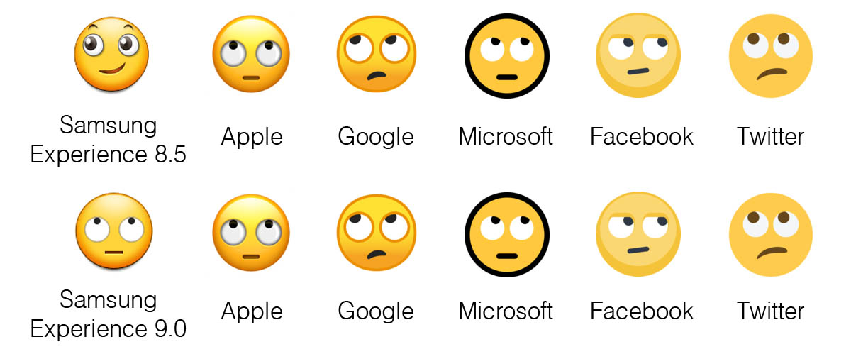
Perhaps the most notable change in this update was not the 🤤 Drooling Face, but that of the 🙄 Face with Rolling Eyes emoji.
This update was only the start for Samsung's journey towards greater design convergence. Since the beginning of 2018, at least seven of the vendor's thirteen updates included a significant number of design changes clearly made in the name of improved convergence with those of other vendors.
You can explore each of these updates via the list below:
- Samsung Experience 9.0 Emoji Changelog (February 2018)
- Samsung One UI 1.0 Emoji Changelog (February 2019)
- Samsung One UI 1.5 Emoji Changelog (August 2019)
- Samsung One UI 2.5 Emoji Changelog (September 2020)
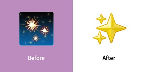
- ✨ Samsung's Shiny New Sparkles Emoji ✨(February 2022)
- Samsung One UI 5.0 Emoji Changelog (October 2022)
- Samsung One UI 6.0 Emoji Changelog (October 2023)
Of these updates, perhaps the most noteworthy is not the platform's near-wholesale revision in One UI 6.0, but rather their February 2022 update to the incredibly popular ✨ Sparkles emoji.
Other Major Design Convergences Since 2018
While Samsung's emoji design set contained some of the most high-profile examples of design divergences between 2012 and 2018, they were by no means the only vendor that made significant changes in the name of design convergence from 2018 onwards.
Take, for example, the original Twemoji design set: since 2018, at least 10 updates included at least one major design revision aimed at achieving greater design convergence with other vendors:
- Twemoji 2.5 Emoji Changelog (February 2018)
- Twemoji 2.6 Emoji Changelog (April 2018)
- Twemoji 2.7 Emoji Changelog (May 2018)
- Twemoji 11.3 Emoji Changelog (January 2019)
- Twemoji 11.4 Changed Emojis (April 2019)
- Twemoji 12.1.5 Emoji Changelog (January 2020)
- Twemoji 12.1.16 Emoji Changelog (April 2020)
- Twitter Updates Syringe Emoji (March 2021)
- Twemoji 13.1.1 Emoji Changelog (March 2022)
- Twemoji 15.0.1 Changed Emojis (July 2023)
(We'll also be discussing the Twemoji emoji design set when we address notable divergences since 2018, but that's for later in this article).
Additionally, Google's emoji design set has seen several updates since 2018 that included at least one convergence-oriented emoji design change:
- Android 9.0 Emoji Changelog (August 2018)
- Android 10.0 Emoji Changelog (August 2019)
- Android 11.0 Emoji Changelog (September 2020)
- Google Emoji 13.1 Changelog (September 2021)
- Android 12 Emoji Changelog (July 2021)
- Google Emoji 14.0 Changelog (November 2021)
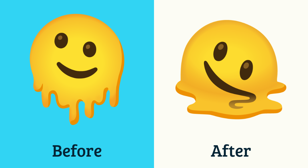
In fact, the most recent update to the Noto Color Emoji design set features several significant changes to the designs of several noteworthy emojis, including the much-loved 🫠 Melting Face.
As for other vendors, Microsoft's list of convergence-featuring changes includes:
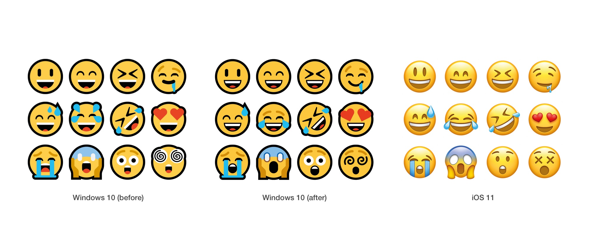
- Windows 10 April 2018 Update Emoji Changelog (April 2018)
- Windows 10 October 2018 Emoji Changelog (October 2018)
- Windows 10 May 2019 Update Emoji Changelog (May 2019)
- Windows 11 Emoji Changelog (October 2021)
- Windows 11 22H2 Emoji Changelog (September 2022)
Meanwhile, across Meta's Facebook and WhatsApp properties, the following updates include notable design revisions intended to create greater convergence:
- Facebook 3.0 Emoji Changelog (December 2018)
- WhatsApp 2.19.7 Emoji Changelog (January 2019)
- WhatsApp 2.19.175 Emoji Changelog (June 2019)
- Facebook 4.0 Emoji Changelog (September 2019)
- Facebook Emoji 14.0 Changelog (April 2022)
- WhatsApp 2.23.2.72 Changed Emojis (January 2023)
- WhatsApp 2.24.2.76 Changed Emojis (February 2024)
- Facebook Emoji 16.0 Changed Emojis (August 2025)
But who is everyone converging with?
When surveying the last eight years of emoji updates across major platforms, a clear pattern emerges: while convergence is often framed as a mutual process, in practice, most vendors have made design changes that move their emojis closer to Apple’s emoji design set.
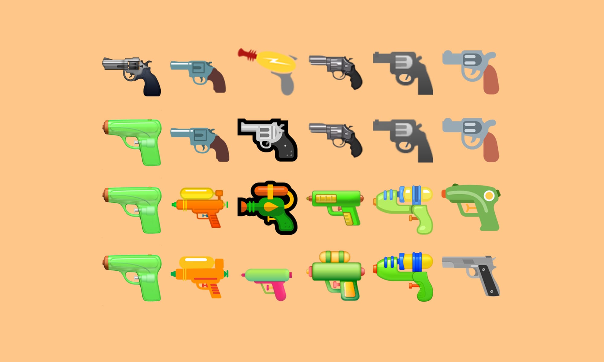
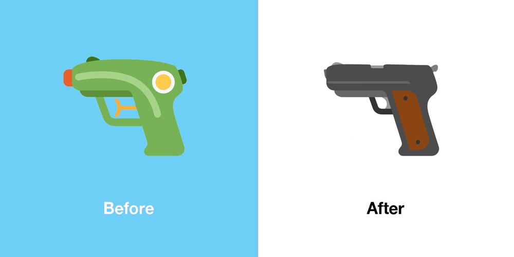
The most prominent and frequently cited example of this phenomenon is the 🔫 Pistol emoji.
Originally depicted as a realistic firearm across almost all major platforms, Apple’s 2016 decision to redesign this emoji as a bright green water pistol proved to be a turning point.
Amusingly, Microsoft's 🔫 Pistol emoji initially had a sci-fi laser gun appearance before revising it to display as a realistic firearm a mere month before Apple made their infamous design change.
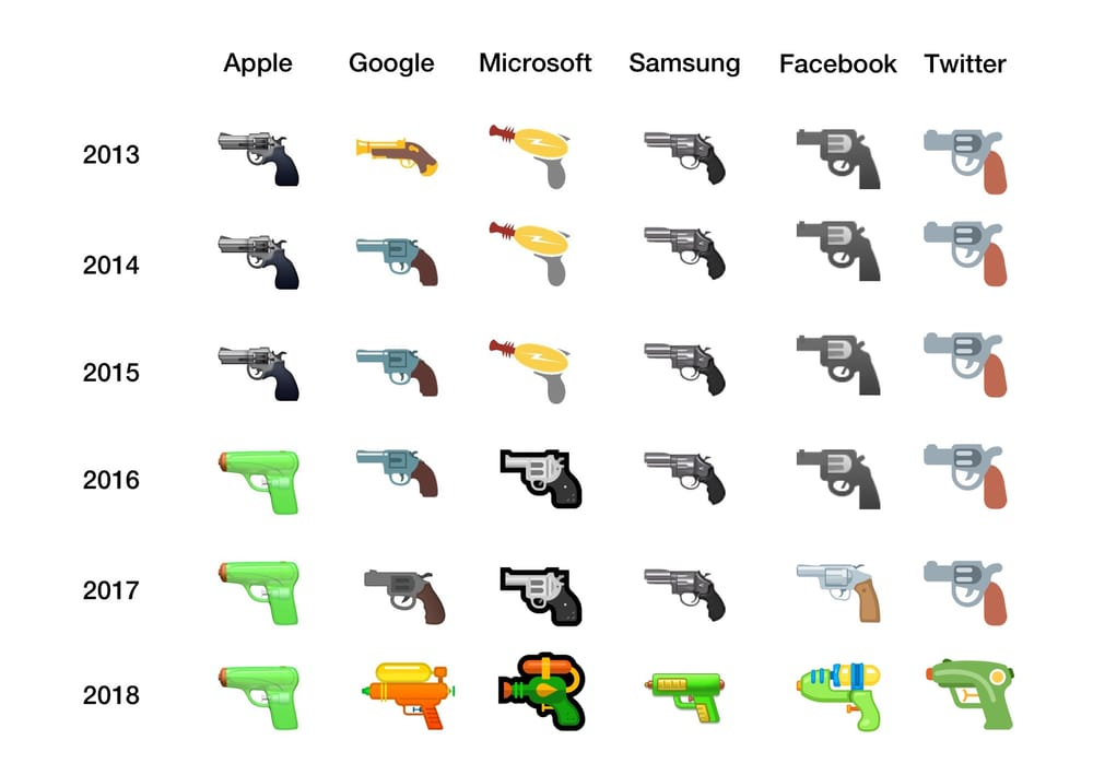
Over the years that followed, Google, Microsoft, Samsung, Facebook, and Twitter all revised their own designs to follow Apple’s lead, ultimately establishing the toy-like water gun as the de facto cross-platform standard.
This would not remain the case on all platforms indefinitely, however, as we will discuss later.
The same pattern can be observed to a certain extent with other notable emojis. Apple’s redesign of the 💉 Syringe emoji to remove visible blood, as well as its revision of the 😷 Face With Medical Mask emoji to appear less distressed and more neutral, were both later echoed by other vendors, though these changes appear to have been made with a great level of consultation with other vendors.
Why Apple, though? And is this always the case?
There are several structural reasons why Apple’s designs so often become the gravitational center of emoji convergence.
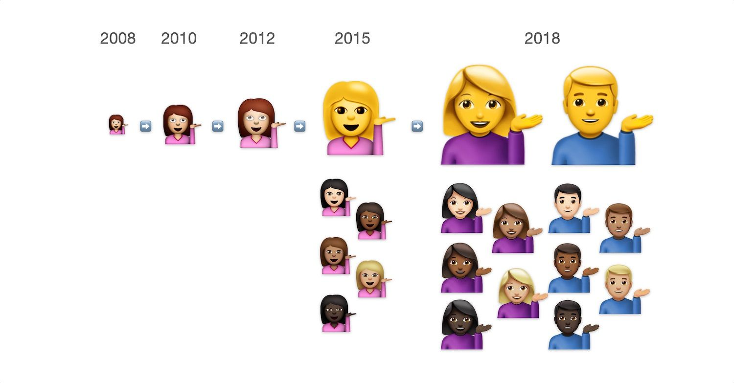
First, Apple is widely regarded as the “default” emoji design set in the West. This status dates back to 2008, when Apple introduced emoji support on the iPhone years before emoji were formally incorporated into Unicode in 2010.
For many early smartphone users outside Japan, Apple’s emoji designs were their first exposure to the modern emoji keyboard.
Additionally, Apple's emoji designs have remained relatively stable since 2008.
Outside of instances of upscaling and improving the diversity of the people emoji, Apple's original emoji designs remain largely as they were in 2008. Compared to other vendors, a relatively small number of designs have had significant compositional revisions.
Market realities for over a decade have also reinforced this influence. Apple continues to command a dominant share of the mobile phone market in the United States.
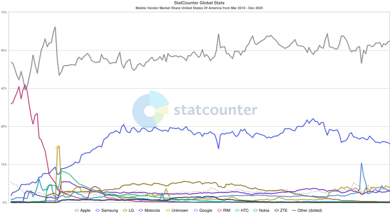
Indeed, many emoji designers across multiple vendors are based in the U.S., where Apple’s emoji designs are deeply familiar and often serve as the informal reference point for what an emoji is “supposed” to look like.
However, Apple’s influence is not absolute. While the trend is definitely towards convergence with their design set, there have been many instances of design changes since 2018 that do not reflect Apple's designs.
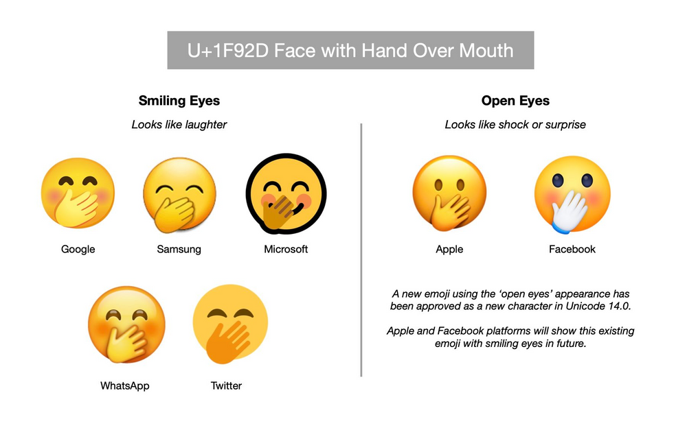
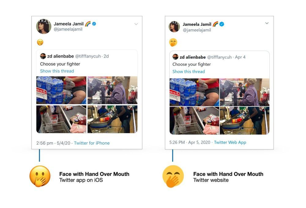
Additionally, there was at least one notable instance where Apple was forced to change one of its own emoji designs converge with those of other vendors: the 🤭 Face With Hand Over Mouth emoji.
Apple’s original implementation diverged significantly in perceived meaning from other vendors: its eyes were open, as if expressing shock instead of amusement.
Such design fragmentation led Jameela Jamil, like Jessica Chastain before her, to make an unintentional emoji faux pas:
Rather than the ecosystem converging on Apple’s interpretation, the Unicode Consortium ultimately approved the addition of a new emoji to resolve the semantic ambiguity: the 🫢 Face with Open Eyes and Hand Over Mouth.
In creating this new emoji, Unicode implied that the original 🤭 Face With Hand Over Mouth should not have its eyes open, and this decision effectively forced both Apple and Facebook to revise their existing designs instead of pulling other vendors toward them.
In fact, a similar approach to this is being deployed within Unicode's draft list for Emoji 18.0, this year's list of new emoji recommendations that is expected to be approved in September.
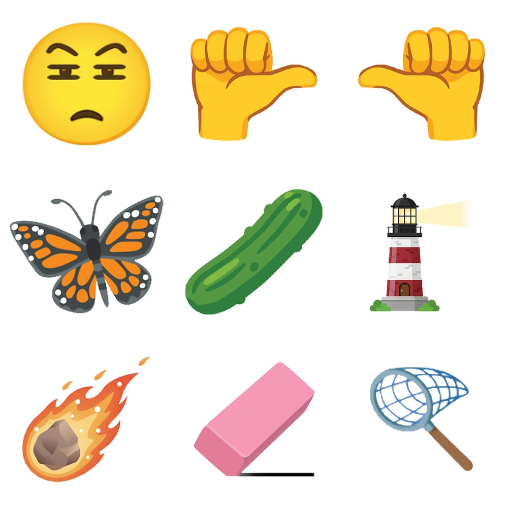
At least three of the proposed new emojis would, if approved, require several vendors to update their current designs for existing emojis:
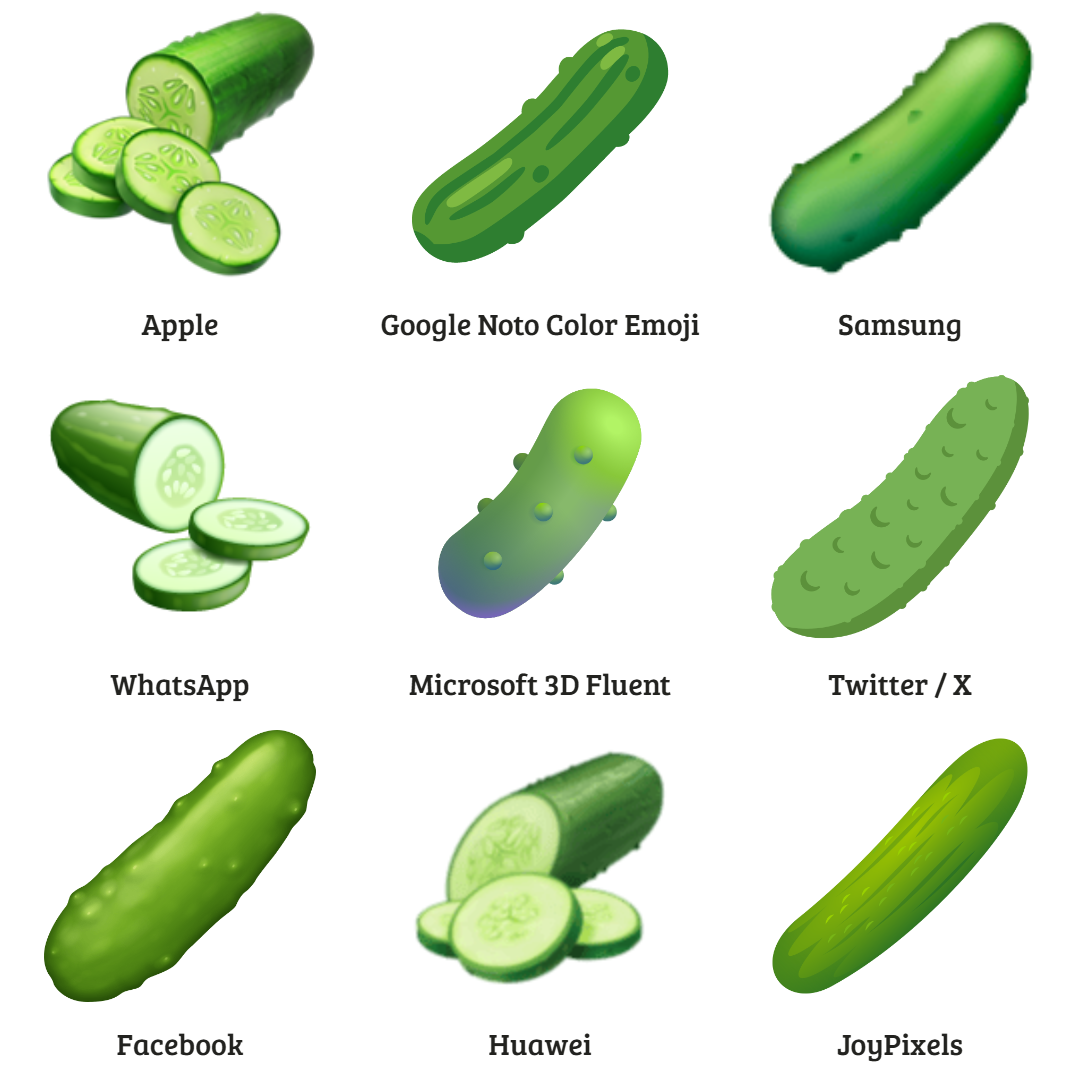
- A monarch butterfly, as opposed to the non-specifying 🦋 Butterfly
- A pickle, as opposed to a 🥒 Cucumber
- A meteor, as opposed to a ☄️ Comet
In each of the above instances, several vendors represent the proposed new emoji concept (e.g., a pickle) instead of the actual intended depiction (e.g., a 🥒 Cucumber).
Additionally, the report from the Unicode Emoji Standard & Research Working Group that proposes these new emojis also included an audit of other emoji designs that continue to have notable design divergence across vendors at the time of writing.
You can read that document here.
Significant Individual Emoji Design Divergences
While convergence has been the dominant trend since 2018, as we have outlined above, it has not gone unchallenged.
The most significant example is X’s decision to revert the 🔫 Pistol emoji back to a realistic firearm in 2024 for web and iOS users:
In fact, the design was revised twice in a short period of time:
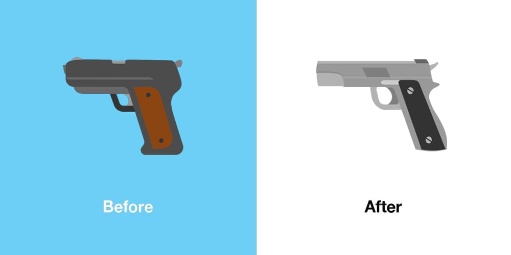
In making these revisions, X intentionally broke with the cross-platform consensus that had formed around the water gun design, reintroducing a symbol that other vendors had moved away from since late 2018, as discussed above.
Additionally, within the last week, X made a similar change away from the expected emoji design consensus when it changed the 🇮🇷 Flag for Iran emoji for its web and iOS users:
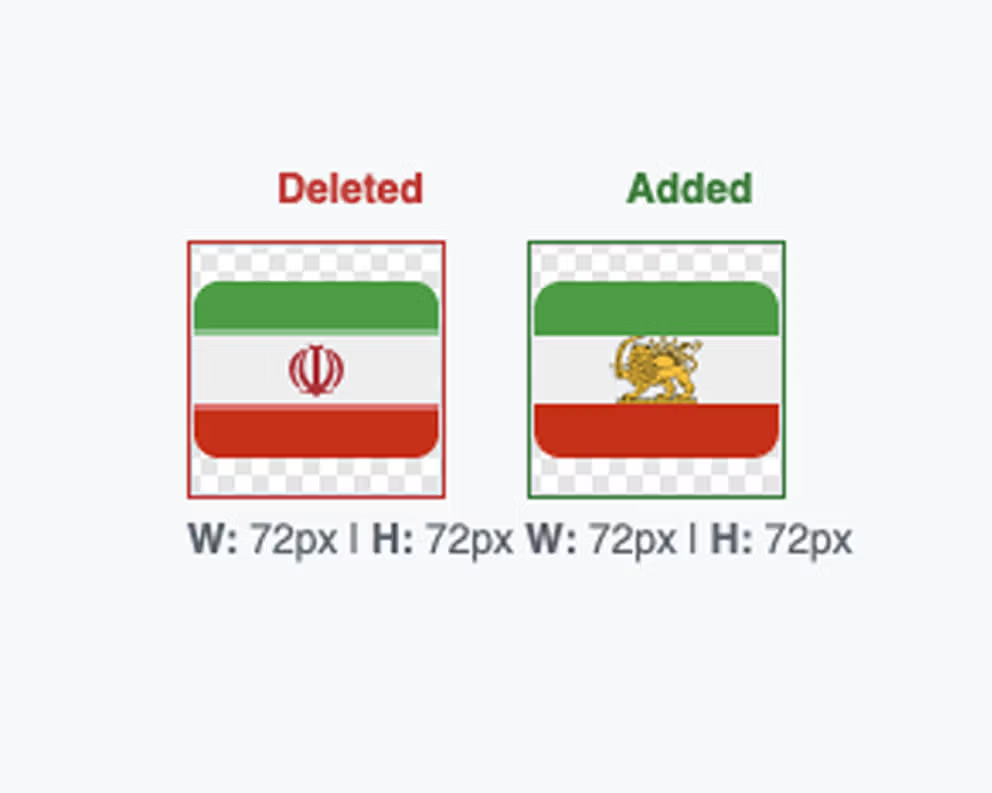
While it has yet to be seen if other vendors will emulate this change in the near future, it appears unlikely given that the de facto official flag of the nation remains unchanged.
You can read more context for why this design change was requested by some here on Wikipedia.
This makes the situation with the 🇮🇷 Flag for Iran emoji distinct from that which occurred with the 🇸🇾 Flag for Syria emoji in 2025.
Additionally, in a so-far unique case, April 2024 saw WhatsApp update the 🏎️ Racing Car emoji design displayed on Android devices as part of a joint marketing campaign by WhatsApp and the Mercedes-Benz F1 team.
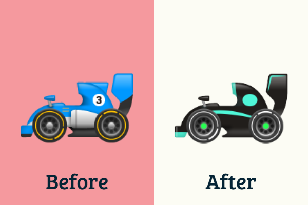
It must be noted, however, that WhatsApp's previous design was already divergent from that of most major vendors, which display the 🏎️ Racing Car emoji as being red instead of blue.
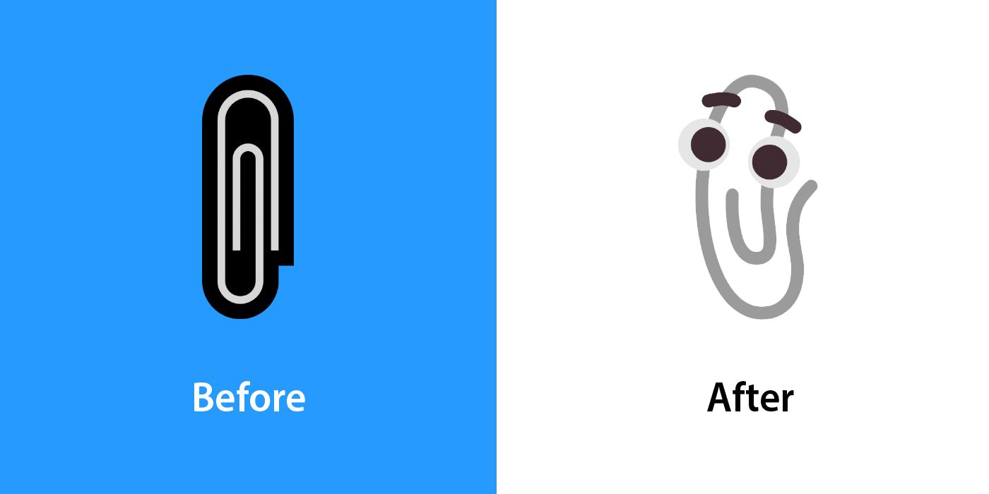
Lastly, another brand-based change was made by Microsoft in 2021: the return of Clippy in the form of a revised 📎 Paperclip emoji design.
Divergent New Vendor Sets
It is not just X that has made the conscious editorial choice to diverge its emoji designs away from an existing design consensus, though these next two examples are from vendor sets that did not exist back in 2018.
The first new vendor set is that of Chinese mobile manufacturer Huawei, which released its own native set of emoji designs in August 2023 via their HarmonyOS 4.0 update.

Many of Huawei's emoji designs contain attributes that are not shared by other vendors, such as the folded hands within the 🥺 Pleading Face emoji design shown below.
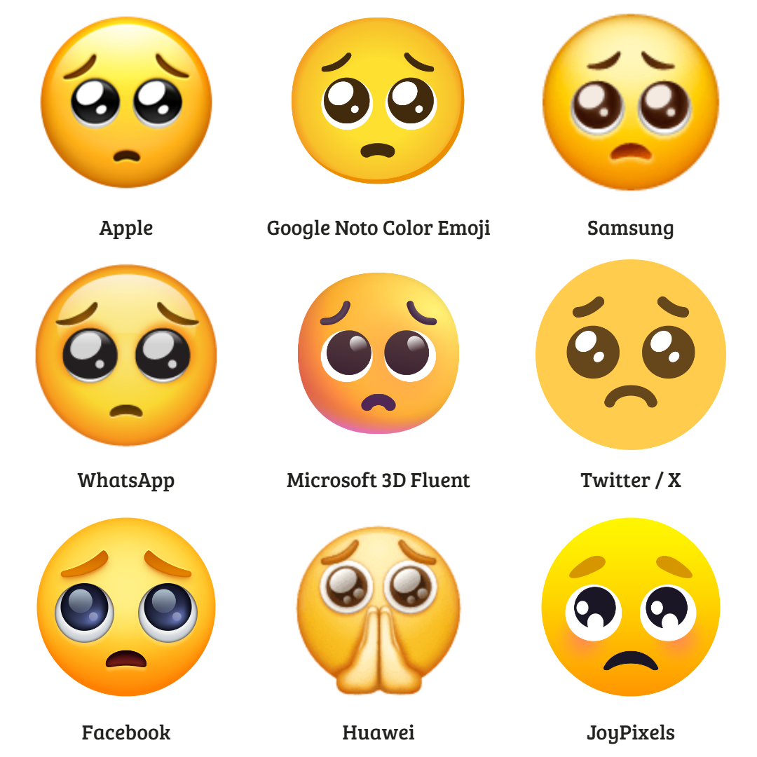
Other examples of this type of design divergence within the Huaweu set include 😙 Kissing Face with Smiling Eyes, 🤑 Money-Mouth Face, 🥺 Pleading Face, 🎌 Crossed Flags, and 🪁 Kite.
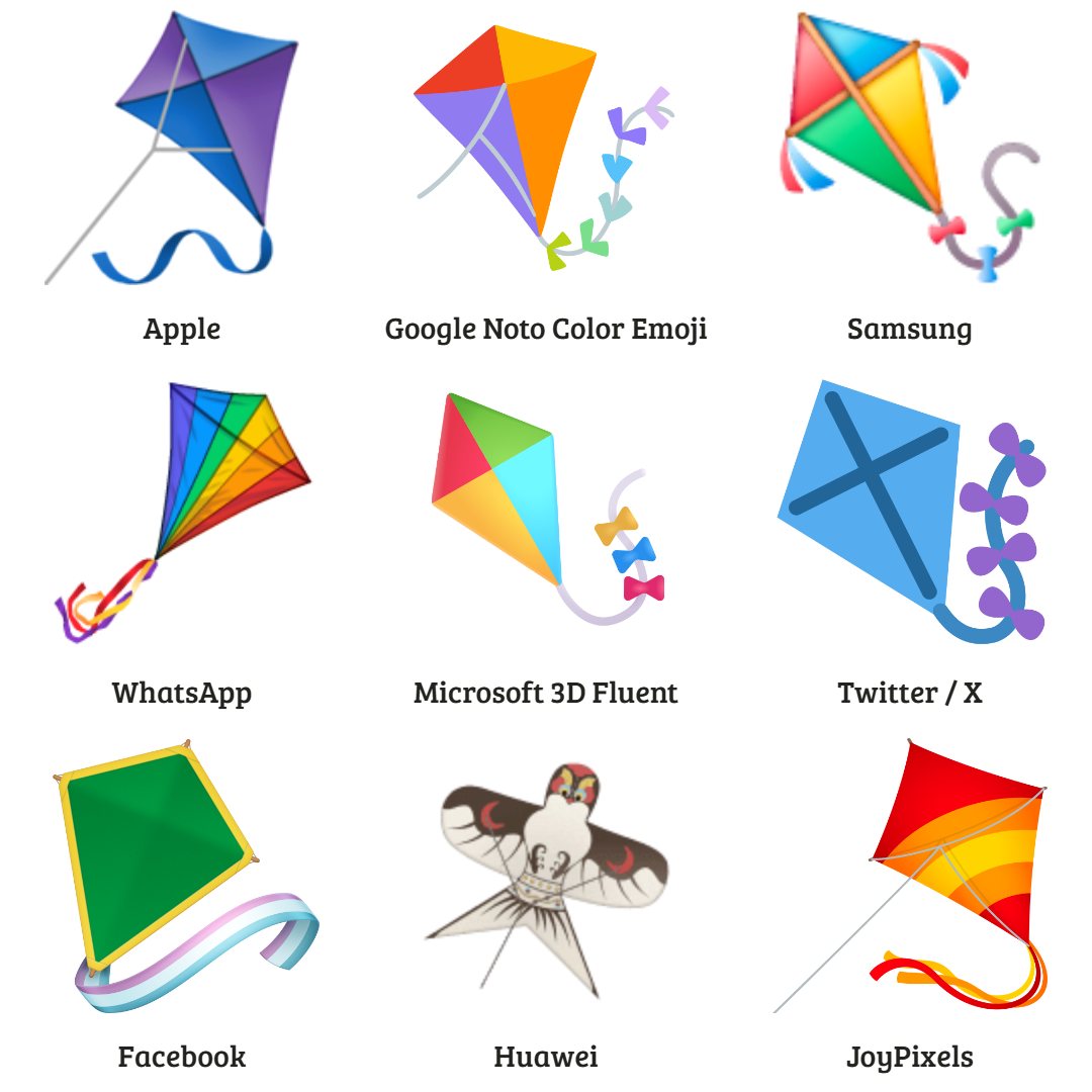
In many respects, the Huawei set harkens back to some of Samsung's earliest design divergences, which featured exaggerated upfixes and some culturally-specific representation (or temporary omissions).
With the 🪁 Kite in particular, we also see a level of cultural representation that has also been attempted by the other new divergent vendor set launched since 2018.
In February 2022, South Korean financial technology company Toss (토스) provided its own emoji design set within its mobile application.
The design set, entitled Toss Face (토스페이스), the emoji set originally included a series of intentionally divergent emoji designs compared to those of other vendors.
All people emoji designs that were typically shown to be facing left were instead positioned facing right.
Outside of the people's directionality, the vendor set's other divergent designs mostly followed two broad themes:
- Firstly, rendering culturally-specific Japanese emojis with designs representing related South Korean concepts (e.g. the 🍶 Sake emoji appearing as makgeolli).
- Secondly, emojis representing older technologies were shown with designs representing more contemporary innovations. (e.g. 📟 Pager displaying as instant messaging speech bubbles; 🛺 Auto Rickshaw being displayed as a drone).
In March 2022, these divergent designs were updated to accurately reflect Unicode's recommendations, though in April 2022, they were re-added to the Toss app using Private Use Area codepoints instead of existing Unicode codepoints.
You can read more about that update here.
The State Of Emoji Design Convergence In 2026
Looking back from 2026, the prediction made in early 2018 has largely borne out: 2018 marked the beginning of a sustained period of significant emoji design convergence, though, in retrospect, it was clearly only the beginning.
Across most major platforms, the risk of sending one emoji and unintentionally conveying another meaning has been dramatically reduced, thanks to years of incremental, often quiet, design alignment.
In practical terms, this has meant that many platforms have gravitated toward an agreed visual baseline (often, though not always, Apple’s designs) while Unicode has increasingly played an active role in resolving semantic ambiguity when visual alignment alone proves insufficient.
At the same time, it is clear that convergence is neither total nor inevitable.
Indeed, given the political undertone of the changes made by X, the marketing-based change by WhatsApp, or the cultural representation within the Huawei and Toss Face design sets, it can be concluded that divergence in 2026 is more knowingly deliberate than it was almost a decade ago.