Apple's Emoji Font Gets Versatile
The way Apple's emoji font works has seen an upgrade in recent times, with new functionality paving the way for more emoji combinations than ever.
iPhone users with the recent iOS 14.5 update might have noticed just how many new couples there are in the list.
Most of these were approved by Unicode Consortium as part of Emoji 13.1, but some Apple just decided to support because they could. And if that seems like a strange way to phrase it, it's worth looking at why this was possible in 2021, but would have been impractical barely a year ago.
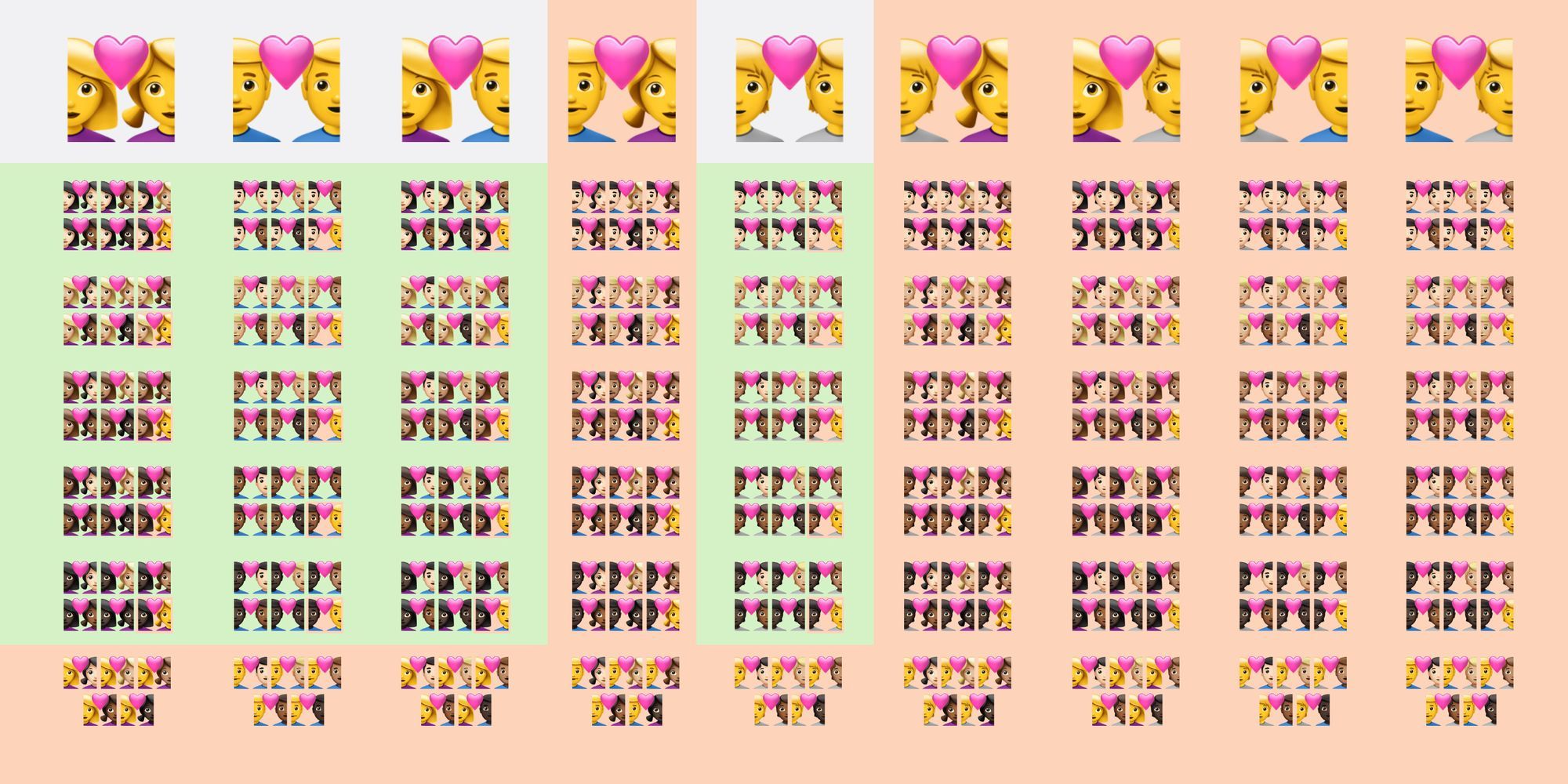
As well as new couples from Emoji 13.1 (https://t.co/PpSN93qXO7) the latest iOS includes 224 additional emojis:
— Emojipedia (@Emojipedia) April 26, 2021
👩👩🏽 Yellow + realistic skin tone
👩🧑 Woman + Person
👨🧑 Man + Person
👩👨 / 👨👩 Reverse-order
🟢 = RGI / compatible
🔴 = Non-standard https://t.co/cD9UPxmSzB pic.twitter.com/PbzAhOCCc8
Using pre-rendered objects scaled down into tiny bitmap images, some emojis on iOS almost look like photographs.
Drawbacks of this approach include large file sizes, and lack of flexibility when it comes to combinations of skin tone or gender. Especially when there's more than one person shown in an emoji.
Of the 669 new emojis were added to iOS last month, 644 are for couples. When you see them side by side, it's pretty clear that a basic pattern can cover just about every combination.
There's a person on the left, one on the right, and a heart in the middle. Only the gender and skin tone changes.
Completely invisible to end-users, Apple's emoji font has been gaining new abilities behind the scenes, effectively able to combine multiple bitmap images in real time, providing flexibility and file size savings.
This is in use in iOS 14.5, and was actually first seen last year with iOS 14.2.
File Size
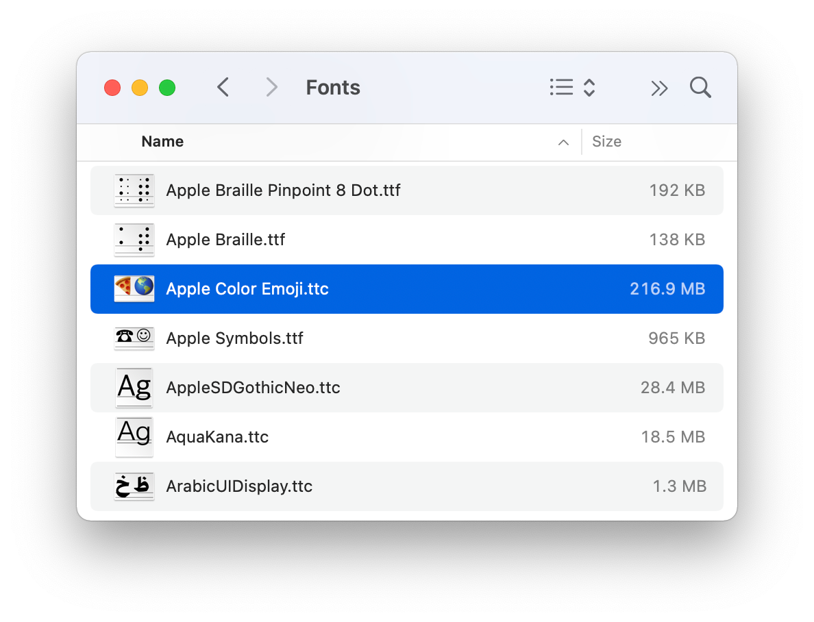
Included inside the Apple Color Emoji font on iOS and macOS are highly detailed 160px images. The level of detail and sharpness in each graphic is sufficient that increasing these to 320px generally still results in a usable graphic.
As of May 2021, the file size of this font weighs in at over 200MB. That might not sound like much, but it's anywhere from 10x to 1,000x larger than most other fonts in use today.
Given that the emoji font is just one tap away at any time, the memory overhead for a font of this size isn't insignificant.
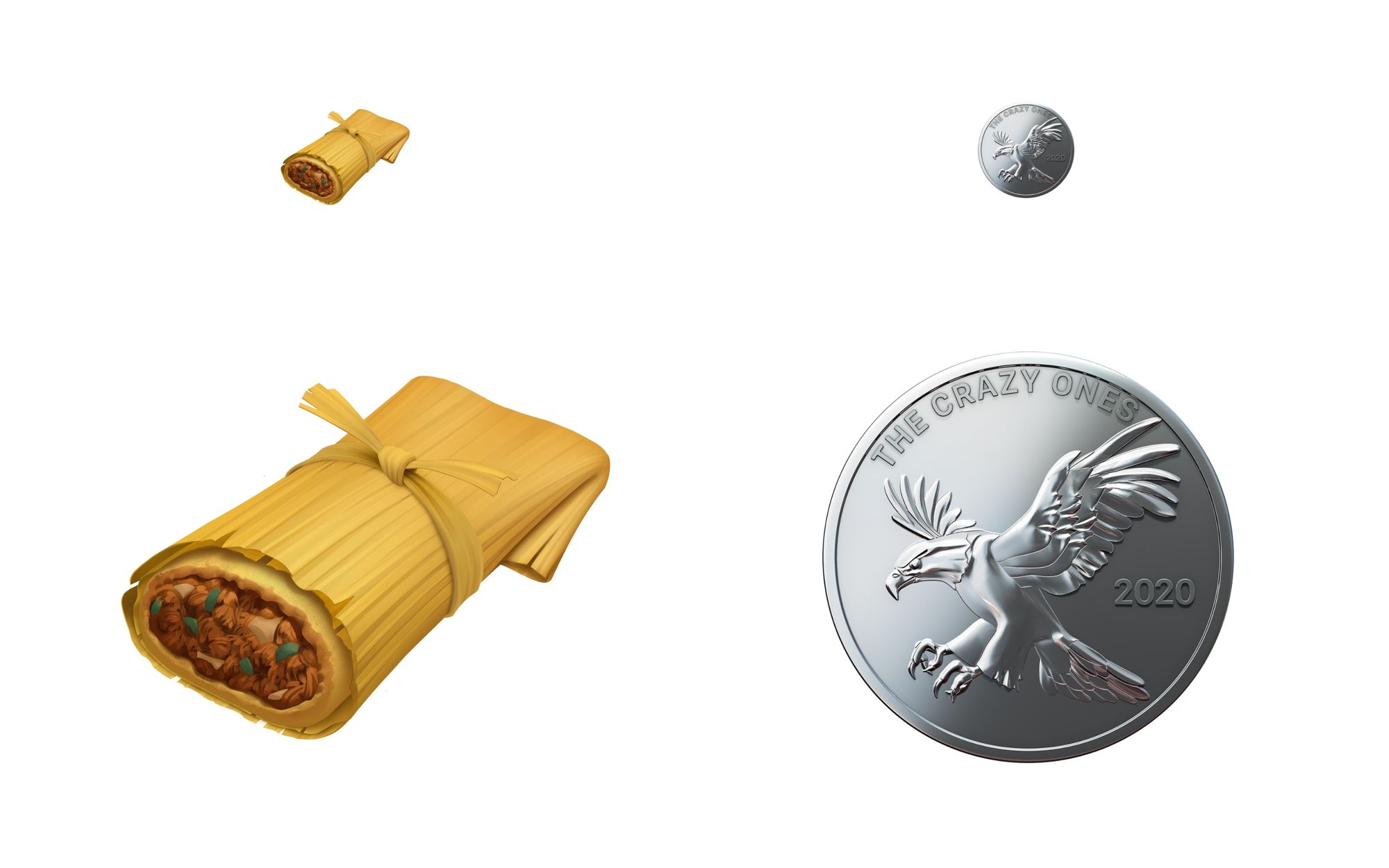
Any graphic designers out there might now be thinking: surely I've seen higher resolution versions of these images? And you might have.
Higher resolution designs are often distributed by Apple as part of press releases showing a particular subset of new emojis. Often scheduled as a first-look preview on World Emoji Day.
Other than compression (both lossy and lossless), there isn't much that can be done to save file size on most distinct emojis. It's the combinations where there's potential file size savings. And those savings potentially unleash new possibilities in future.
Flexibility
With 3,521 standard emojis considered Recommended for General Interchange by Unicode in Emoji 13.1 - and even more emojis supported on iOS and macOS than the standard set - finding ways to be more efficient with this large bitmap font makes sense.
Here's the change quietly made in 2020, shipping as part of iOS 14.2:
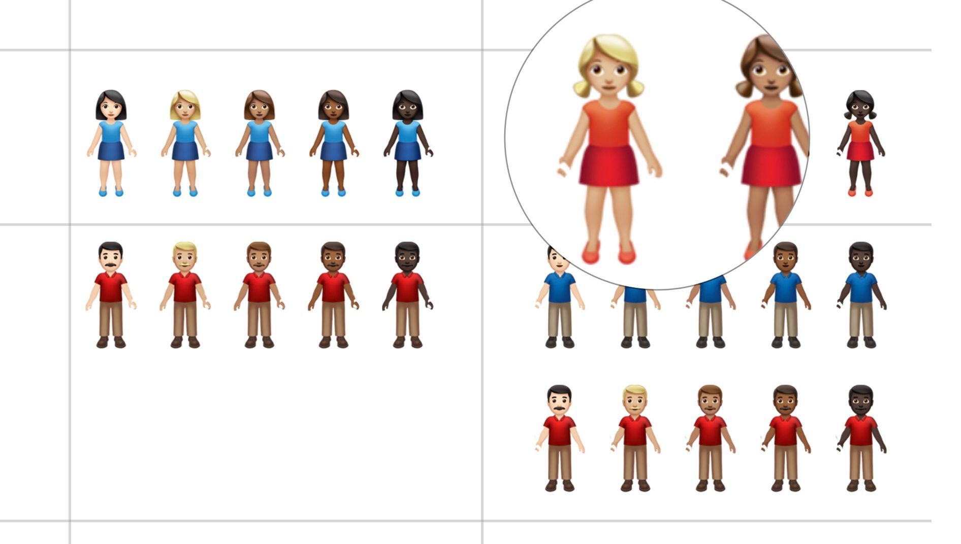
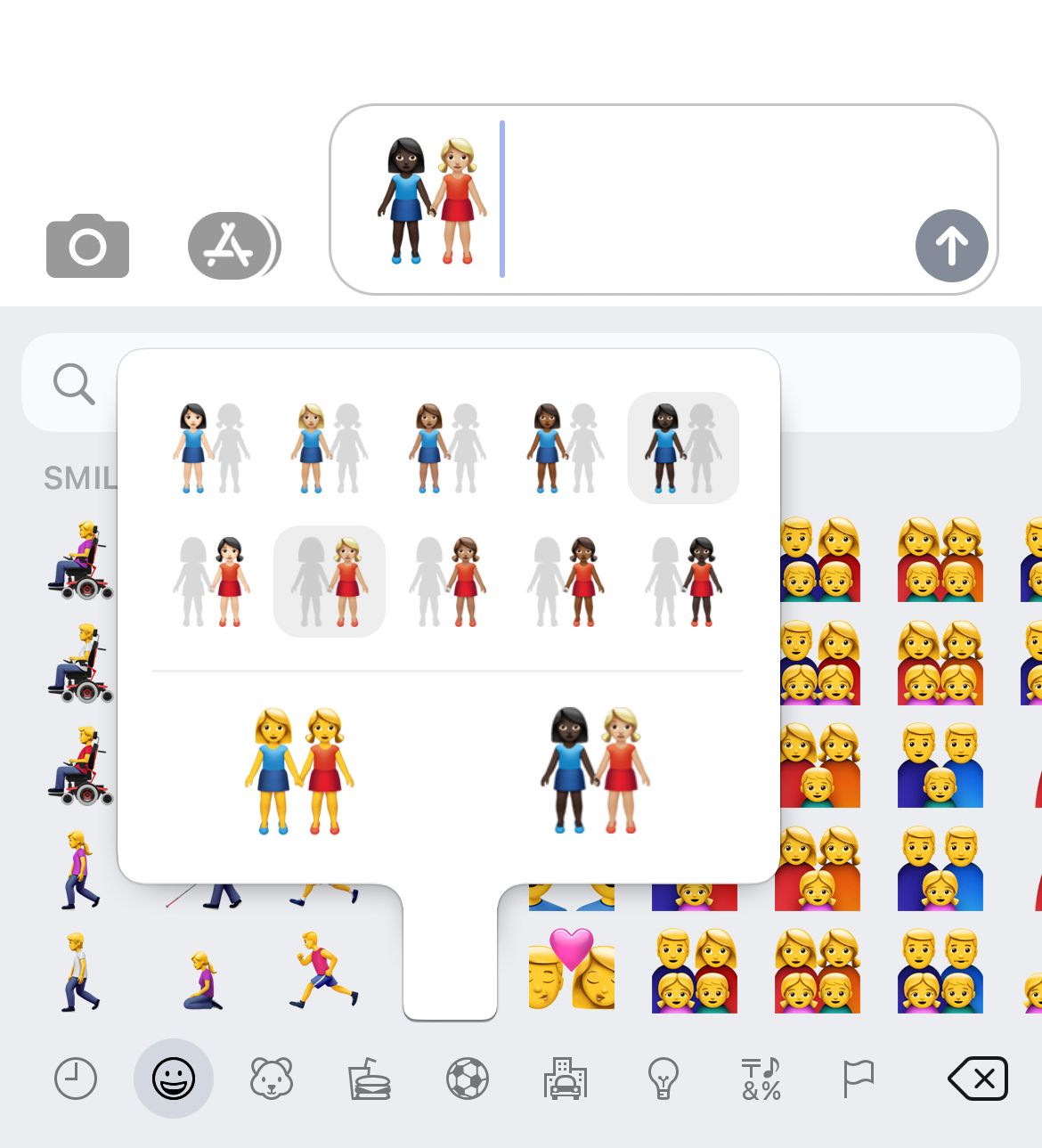
Imagine silhouettes for each woman or man that can hold hands. These can combine with the same gender (woman, woman or man, man) or each other (woman, man).
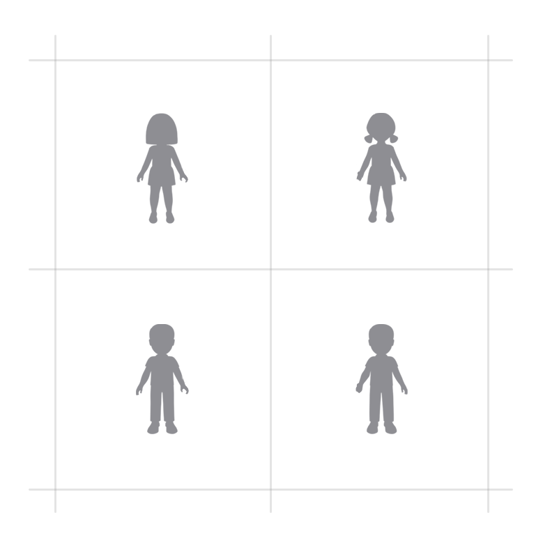
While these shapes might look similar to the 🧍♀️ Woman Standing or 🧍♂️ Man Standing emojis, these are subtly different in how the hands are held outstretched to reach the other person.
Shown with skin tones, the arrangement is easier to see when observing each side:
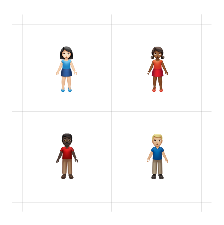
Note the hands. Each is cut out so there's no overlap when combining into a single emoji for display. Whether this is a technical limitation or simply an implementation choice isn't clear.
What this does mean is the unique art is needed for the people that stand on the left or right.
This was already the case in Apple's designs which use different hair styles for the women, depending on whether they stand on the left or right.
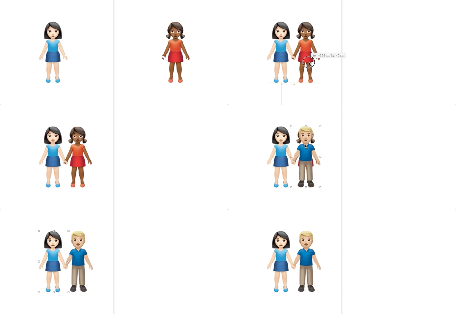
This implementation also contains two sets of artwork for the man standing on the right. Why?
In Apple's font, the man on the right has no moustache and a blue shirt when holding hands with a man, but a moustache and red shirt when holding hands with a woman.
The woman on the left uses the same artwork, regardless whether she is holding the hand of a woman or man.
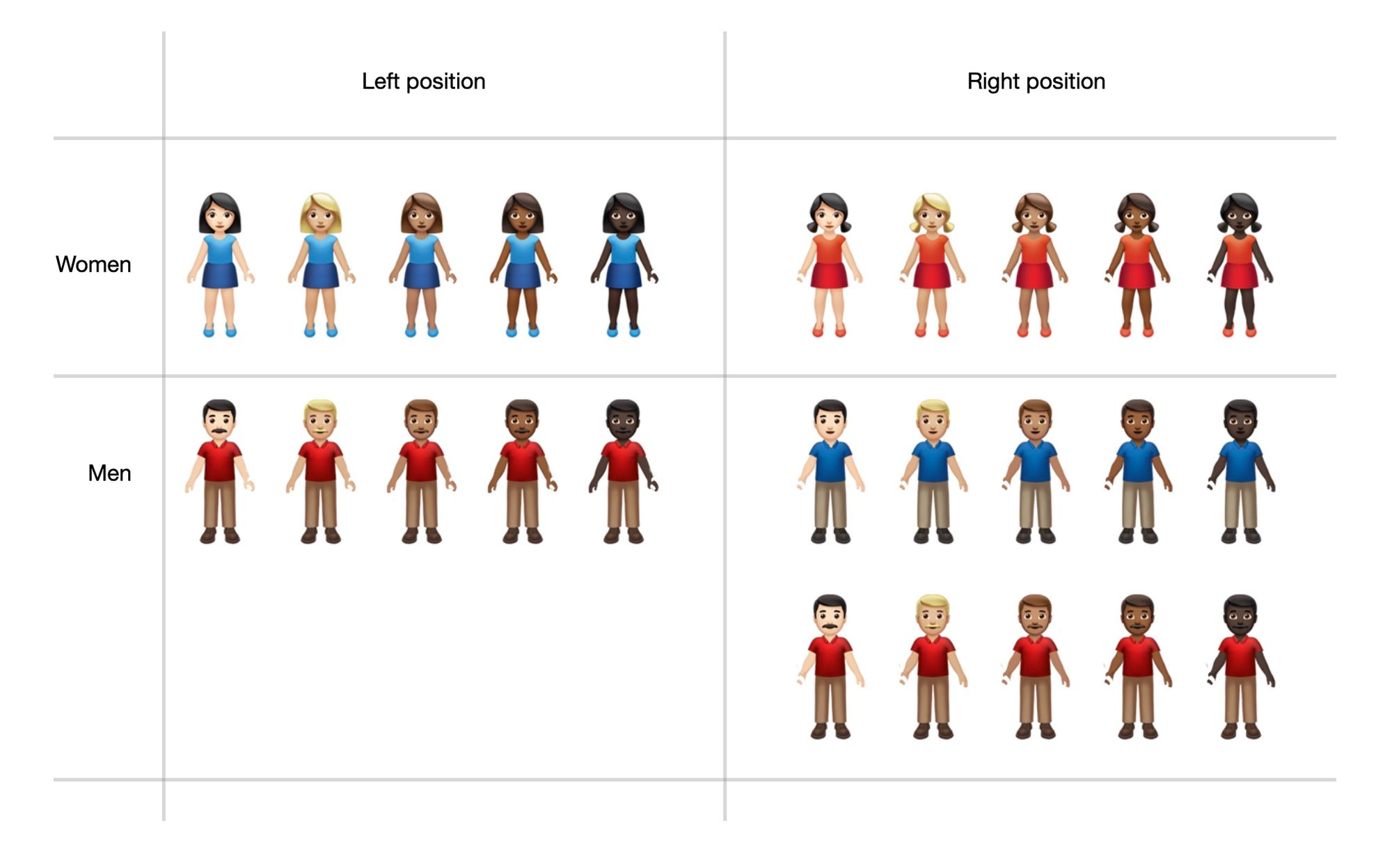
Not shown above: neutral skin tone options, or gender-neutral options.
There is an emoji for 🧑🤝🧑 People Holding Hands but this doesn't use this new combining technique within Apple's font. All combinations of that emoji are pre-rendered within the font, in the same way that all hand-holders were prior to iOS 14.2.
As these can't mix and match with the full set of women or men with skin tones, it might have been considered more expedient to simply leave these as pre-rendered graphics.
The same technique above is used in the hundreds of new couples that came as part of iOS 14.5. Except that implementation took it further and allowed all manner of non-RGI emoji combinations, if you know where to find them. This includes combining one person with a realistic skin tone and the other with default-yellow; or allowing combinations of the gender inclusive 'person' emoji and a woman or man.
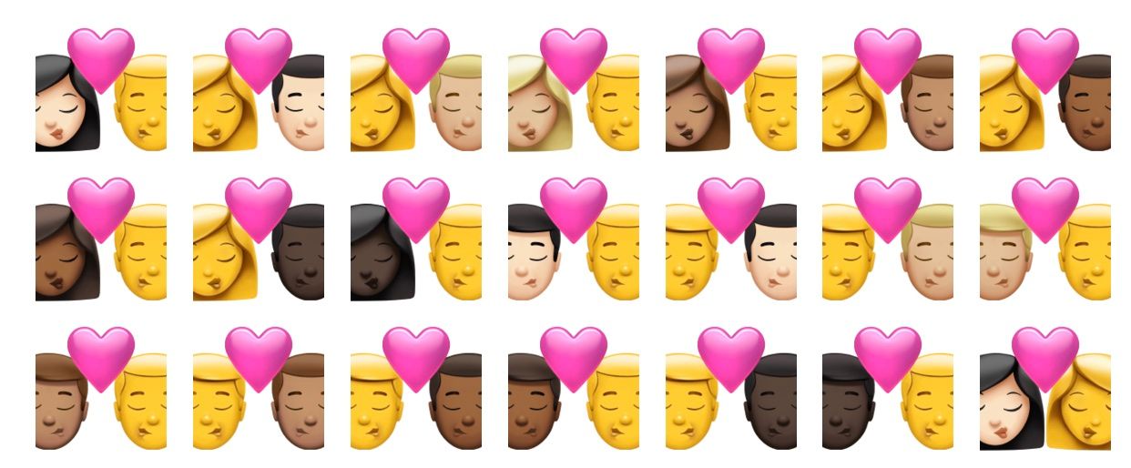
Less useful, but still permitted in the iOS 14.5 emoji font is the ability to change the order: Woman-Man (RGI) or Man-Woman (non-RGI). Person-Woman, or Woman-Person. You get the idea.
None of the non-standard combinations show on the emoji keyboard as an option. But they are now supported in the font, if you know where to copy and paste one from.
What Happened Before?
What's interesting about this change is many readers might have already assumed this is what Apple's doing.
The user interface to choose a two-person emoji certainly gives the impression you are building the emoji yourself. Not just selecting from a predefined list.
Previously, every possible combination had already been pre-rendered as a separate graphic. What's new here is that the font now works in the way the user iterface suggests it does.
What are other platforms doing?
Samsung's emoji graphics are bitmaps just like Apple's, and at this stage there is no sign of a change to how these are created.
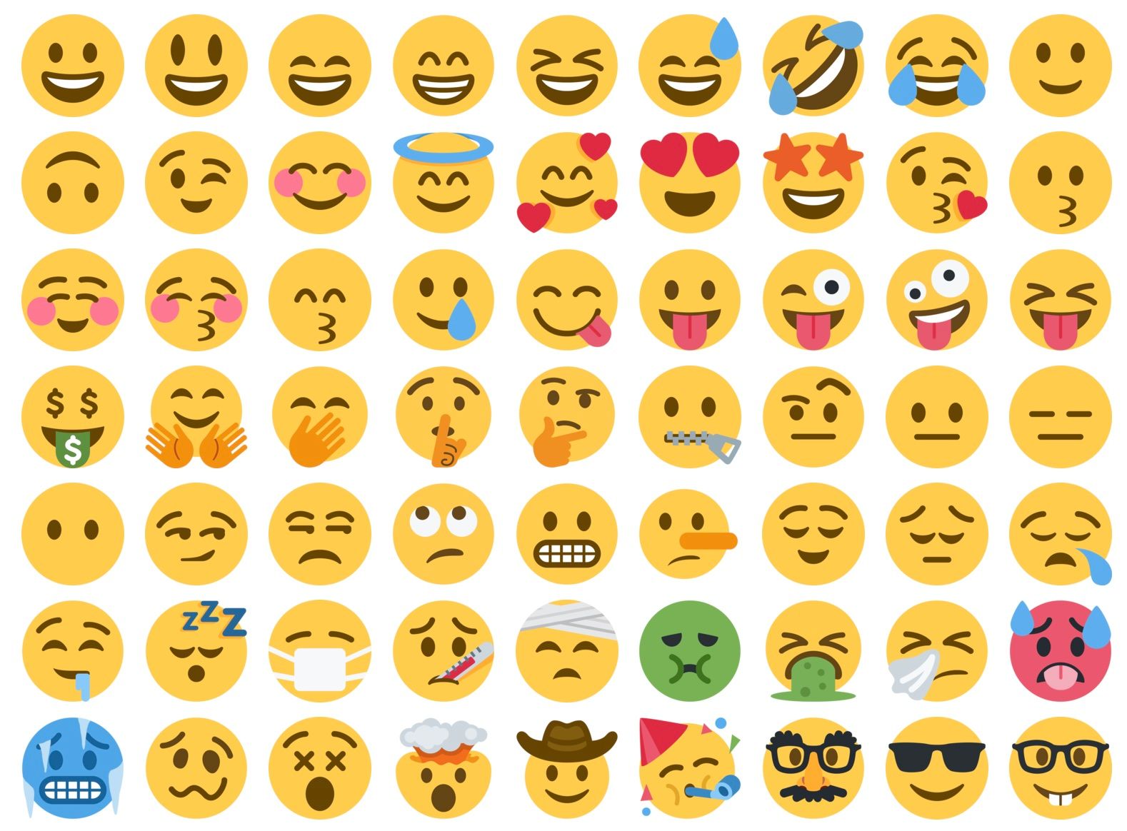
Twitter's Twemoji uses scalable vector graphics (SVG) for its website, which is flexible in many ways, if necessary. Whether this is also replaced with a glossy bitmap-style emoji set in the future isn't yet certain.
Google's emoji font is based on vector graphics, but currently rendered to bitmap for display on Android. It is feasible that Google could switch to using vector graphics and layers for future emoji updates, if the benefits were deemed worthwhile.
Microsoft touted its vector font technology in 2016, showing off thousands of emoji combinations not supported or possible on other platforms at the time. Of all the platforms, Microsoft is best placed for a flexible emoji future, should one come to pass.
But Why
Why would Apple go to all this effort to change how this one color font builds a subset of emojis?
The space saving reason is valid. This font is included as part of macOS and iOS, but also smaller platforms like watchOS. Given the number of skin tone combinations added in the past few years, space saving is worth doing.
- In 2019: 200 new versions of 🧑🤝🧑 People Holding Hands were added to Emoji 12.0 and Emoji 12.1.
- In 2021: Apple added 644 versions of 💑 Couple with Heart and 💏 Kiss in iOS 14.5.
What's more likely though is the logic that Apple is planning for a future where thousands of new emoji combinations exist.
Despite Unicode ruling out expansion of the family emoji set to include skin tone support, this remains a possibility in future if vendors decide to re-assess and go down that path.
Individual companies can already do this if they wish, as demonstrated by Facebook with 125 family emoji combinations, and Microsoft with over 52,000 hidden in the emoji font.
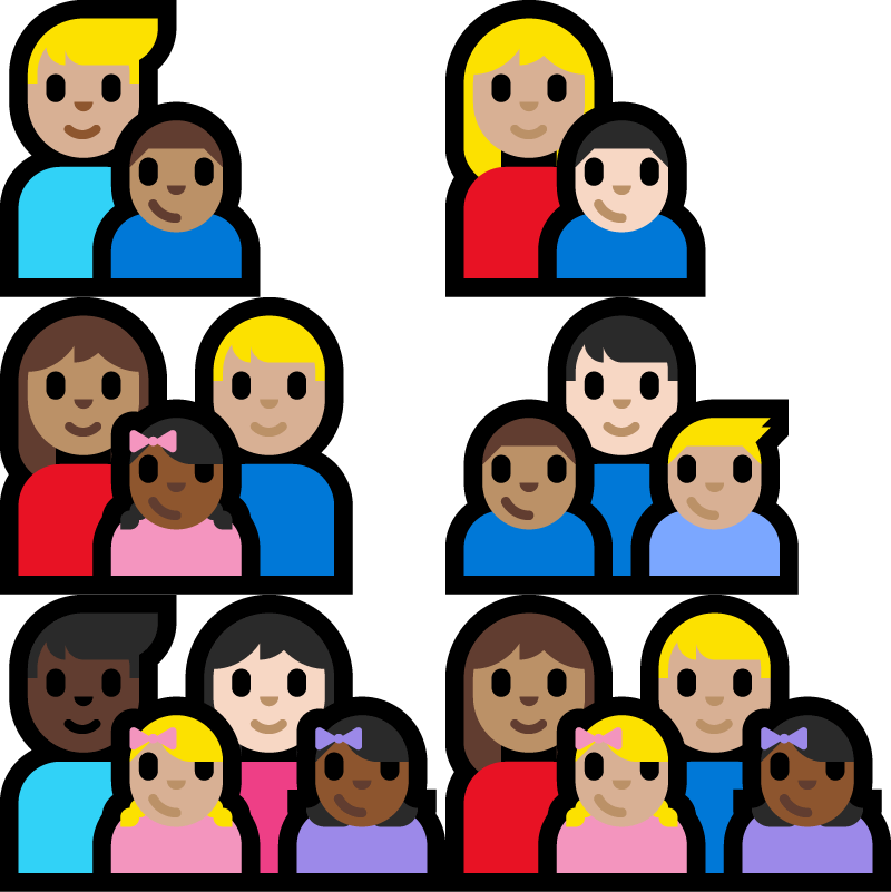
The lack of a black family emoji remains a very popular request. If implemented, it would likely come alongside support for any family member to have any skin tone. According to a Unicode report, this means at least 7,000 new combinations.
Apple’s VP of human interface design Alan Dye told Emojipedia in 2018, that diversity in the family emoji set is a topic the team at Apple talks about “all the time”.
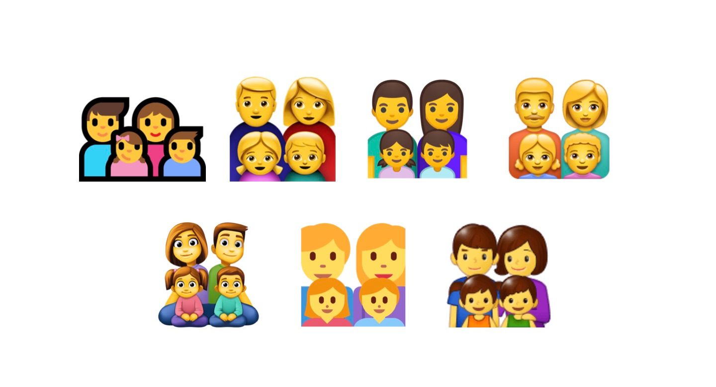
I should be clear here. This is purely speculation that the reason Apple might have gone to this effort to allow additional versatility in the emoji font is to provide diverse family support in future.
It's entirely possible this was done for other areas of customization (more red-heads anyone? further avatar-like details?), or simply to save on file size for the current set. With that said, the number of non-standard combinations of couples supported in iOS 14.5 certainly hints at a test run to see how well an extended emoji set would work.
Not showing the extended options on the emoji keyboard is also an effective way to ensure the majority of users aren't sending these to other platforms which won't support them.
If iOS does get a broader set of emoji options in future, be that for diverse families or any other extension of what's available today, it's likely this niche font change is what will enable it.
