Why does the 📈 Chart Increasing emoji show in red?
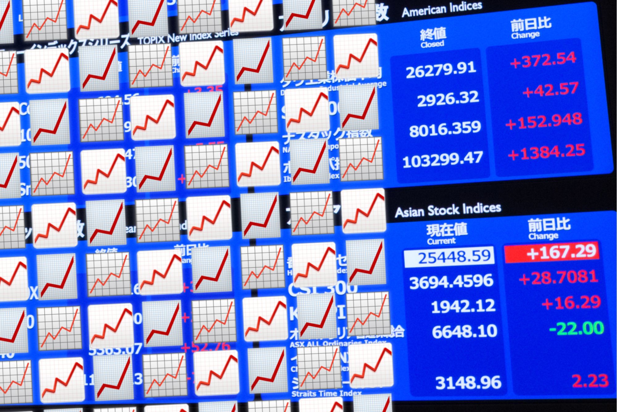
It's a small but persistent emoji query: one that finds new life whenever there's a new development in the "stonks" discourse: why is the upward line on 📈 Chart Increasing displayed in the seemingly-counterintuitive color red?
The answer to this question is actually quite simple, but is an excellent example of cross-cultural variation in color semantics and its impact on emoji design.
🗾 Land Of Emoji Origins
In Japan, the country where the first emoji sets originated, red is traditionally used to represent increases in the value of a stock.
Meanwhile, green is used to represent decreases in stock value.
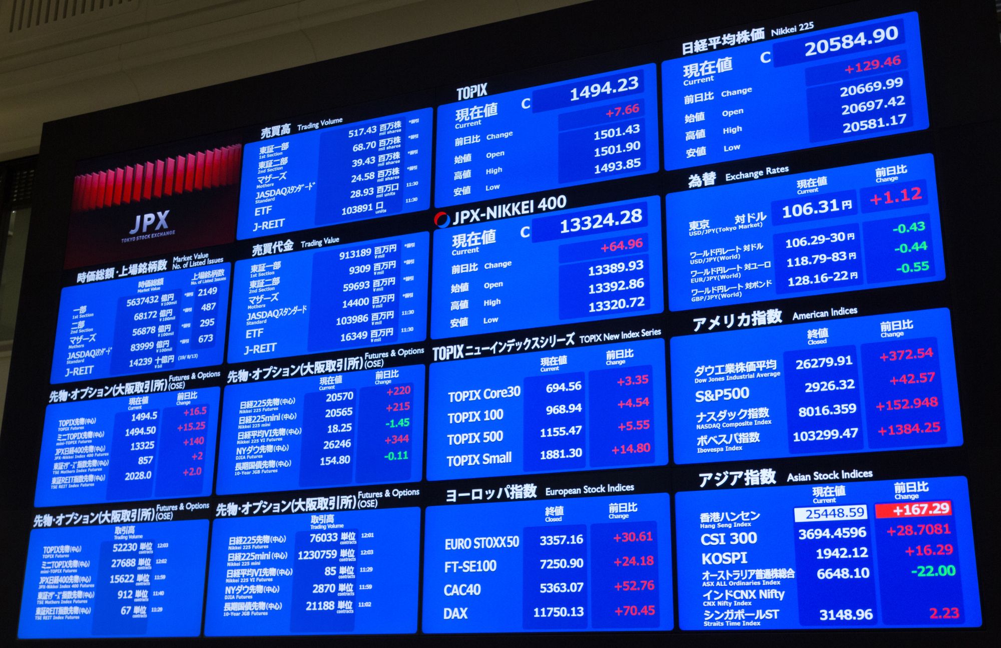
Above: a Japan Exchange Group (JPX) display screen with stock increases shown in red text.
ok we don't understand stonks but we do get emojis:
— Emojipedia (@Emojipedia) January 27, 2021
Why is the 📈 Chart Increasing emoji shown in red and not 🟢 green?
This emoji originates in Japan, and is shown in red there, because that's the color used on the Tokyo Stock Exchange for increases https://t.co/lETnOR2UHg pic.twitter.com/t2LMcBJlWJ
This is in contrast to how many western cultures use the color red in financial contexts, where it represents debts, losses, and bankruptcy.
Take for example the English language idiom "in the red".
Despite this being somewhat confusing for western audiences, the red upward line has persisted across many emoji vendor updates in the name of backwards compatibility and maintaining the reference to the design's cultural origins.
🎨 Current Color Comparisons
However, not all of the 📈 Chart Increasing's current designs appear with a red line.
At the time of writing, 📈 Chart Increasing's line is shown in red across seven active emoji sets[1], compared to three displaying the line in green.
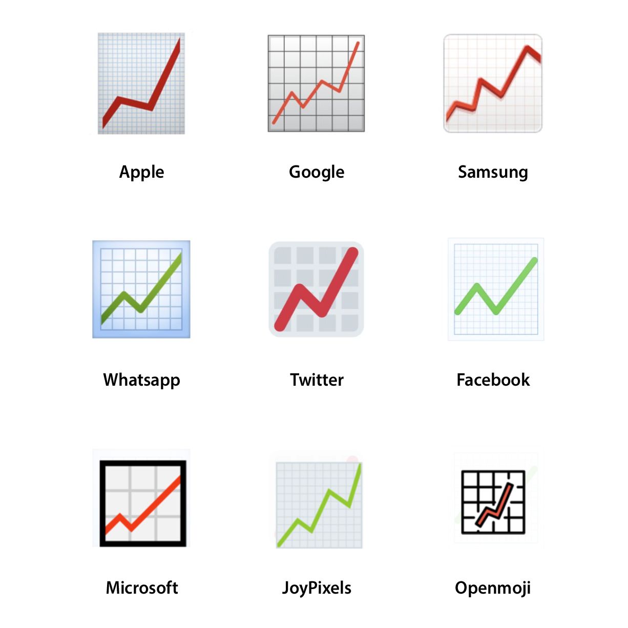
Above: a comparison of the 📈 Chart Increasing emoji across nine different active emoji vendors.
Significantly, 📈 Chart Increasing's line is red within the emoji set used within the default emoji keyboard of the majority of the world's mobile devices[2]: Samsung, Apple, and Google[3].
Source: StatCounter Global Stats - Device Vendor Market Share
🔴Left On Red
Apple was the first western platform to introduce the 📈 Chart Increasing emoji, with iPhones debuting the original design in 2012's iOS 5.1.
Apple's original emoji set was introduced four years earlier, and was heavily inspired by the Softbank's 2006 designs.
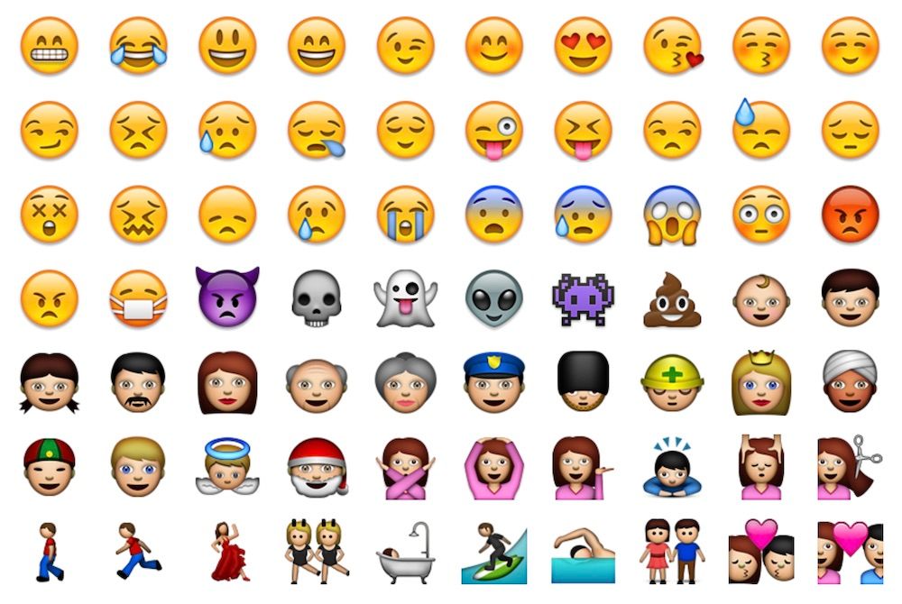
Above: a selection of Apple's original 2008 emoji set.
While Softbank itself did not include a version 📈 Chart Increasing until 2014, the original Unicode proposal for encoding 📈 Chart Increasing argues for this emoji's creation based on two other existing emoji designs.
These emoji designs were au by KDDI's 2005 📈 Chart Increasing design and Softbank's 2006 💹 Chart Increasing with Yen design[4]: both of which displayed their upward trending line in red.

Above: the original proposal for the 📈 Chart Increasing emoji in Unicode's 'Emoji Symbols: Background Data' document from 2009.
📈 Chart Increasing was next introduced via Google's Android 4.3 and Microsoft's Windows 8.0 update. While neither of these designs displayed in color, both eventually choose to display the upward trending line in red in 2013 and 2018[5] respectively.
Meanwhile, Samsung's first design for 📈 Chart Increasing debuted in 2013's TouchWiz Nature UX 2 with a red upward line.
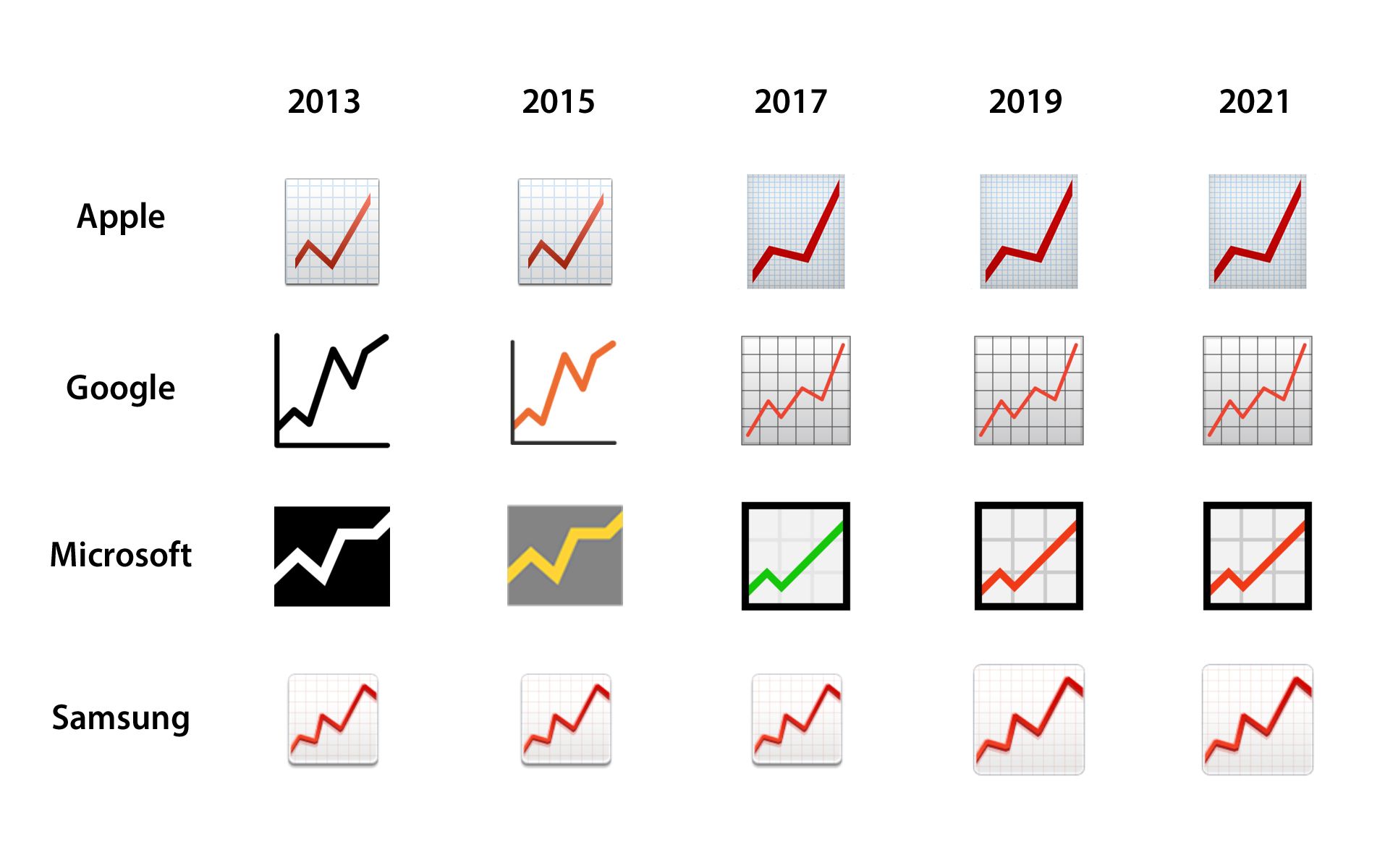
Above: comparison of the 📈 Chart Increasing emoji across Apple, Google, Microsoft and Samsung platforms.
So from 2013 onwards, Apple, Google and Samsung - the aforementioned default emoji designs on the majority of mobile devices - have left the upward trending line of 📈 Chart Increasing displaying in red.
🤓 Summary
So, in conclusion:
- The 📈 Chart Increasing includes a red upward trend line as that is the normal within the Japanese financial sector.
- The majority of active emoji design vendors currently display with a red upward line 📈 Chart Increasing.
- Apple first introduced the 📈 Chart Increasing emoji to the western world in 2012, with its initial design including a red upward line.
- Unicode's original proposal to encode 📈 Chart Increasing was based on au by KDDI's 2005 📈 Chart Increasing design and Softbank's 2006 💹 Chart Increasing with Yen, both of which included a red upward line.
📖 Read More
- SoftBank is now on Emojipedia
- Who Created The Original Apple Emoji Set?
- Apple's Emoji Evolution 1997—2018
- Apple Emoji Turns 10
This includes the Sony Playstation emoji set, which we hoping to have featured on Emojipedia in the near future. ↩︎
Apps such as Twitter and Facebook use their own custom emoji implementations on Android devices, while WhatsApp features both its own custom emoji set and custom emoji keyboard. Meanwhile, Apple devices such as the iPhone and iPad use Apple's own emoji design set across these platforms. ↩︎
While Google itself does not hold a significant proportion of the mobile device market with its Pixel series, other manufacturers that make use Google's Android OS such as Huawei and Xiaomi use Google's emoji design set. ↩︎
While 📈 Chart Increasing would not debut within Softbank's emoji set until 2014, 💹 Chart Increasing with Yen displayed a red upward line since the introduction of vendor's original color emoji set in 1999, back when the company operated under the name J-Phone. ↩︎
The Microsoft incarnation of 📈 Chart Increasing has had an varied history: its first color-imbued appearance was grey square with a yellow upward line between 2013 and 2016. With the 2016 Windows 10 Anniversary Update updating its apperance to include a green upward line, but that was replaced with a red line in 2018, a big year for emoji design convergence. ↩︎
