How Do You Like Your Burger Emoji?
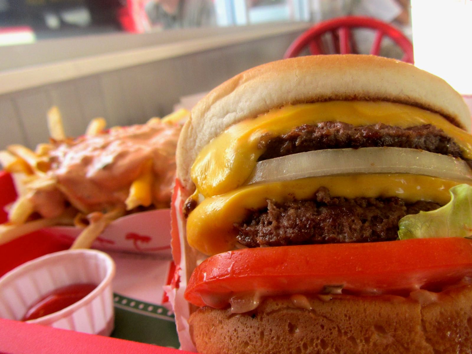
Google CEO Sundar Pichai responded to feedback on the weekend about the ingredients in the Android burger emoji saying he will “drop everything else we are doing and address on Monday”.
Specifically, Pichai was replying to a tweet from Thomas Baekdal who asked why Google would put the cheese underneath the burger in their emoji:
Will drop everything else we are doing and address on Monday:) if folks can agree on the correct way to do this! https://t.co/dXRuZnX1Ag
— Sundar Pichai (@sundarpichai) October 29, 2017
As you may be aware, each emoji is approved by Unicode, but the actual appearance is a decision for each vendor. Just like fonts for regular text vary between fonts (the letter a might take many forms), the burger I see isn't necessarily the burger you see.
The 🍔 Hamburger emoji keeps similar ingredients on most platforms, but at the time of writing the order in which they are stacked differs considerably:[1]
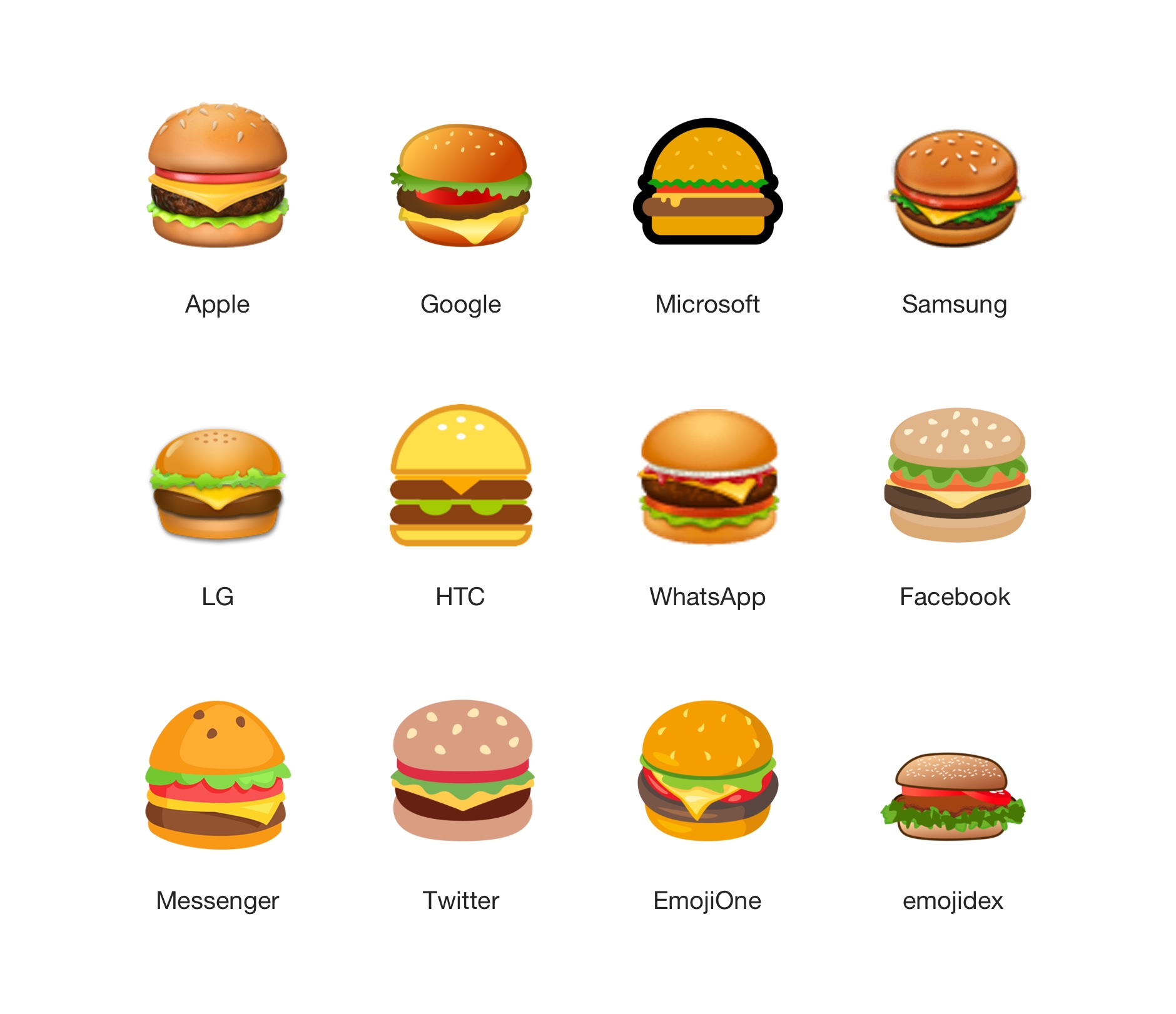
There was one caveat from Pichai who said Google would look at this emoji right away “if folks can agree on the correct way to do this!”.
So in an effort to gain some consensus, we've run this poll to help sort out a preferred order in time for Pichai's Monday morning work meeting:
📊 Poll: help @sundarpichai out here! The correct ingredient order for burgers from top to bottom is:
— Emojipedia 📙 (@Emojipedia) October 29, 2017
It seems that the majority have voted for this order from top-to-bottom:
- 🥗 Salad
- 🧀 Cheese
- 🍖 Meat
In the "other" category, some wondered whether any vendor displays the 🍔 Hamburger correctly, noting that what is being shown should be referred to as a cheeseburger:
@Emojipedia can u plz explain how this is the BURGER emoji but this description describes a CHEESEBURGER? This is not trivial! 🤣 https://t.co/Gb02j0ZOOl
— David Cop A Feel (@jenniferdaniel) October 29, 2017
Putting aside the hamburger-cheeseburger question, what do other vendors think about the correct order to stack a burger?
Microsoft
Judy Safran-Aasen, Font Program Manager at Microsoft responded via email:
“You never put the tomato directly adjacent to the bread as it makes the bread soggy. Lettuce and tomato should be together”
Regarding the idea of cheese sitting further down the stack:
“I think our order placement is correct and agree cheese under the burger is odd”
Microsoft has revised the burger emoji in Windows 8.1, Windows 10 Anniversary Update, and again in Windows 10 Fall Creators Update. The most recent update was in response to user feedback regarding the lack of vegetables, and had multiple prototypes created along the way.
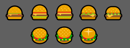
Above: Microsoft created multiple burger designs before releasing Windows 10 Fall Creators Update.
Twitter Design Lead Bryan Haggerty discussed an earlier version of the Twemoji burger that only featured meat and cheese:
“When looking at the burgers from other vendors at the time we had felt that ours with just the patty and cheese felt a bit sad, and certainly not a mouth watering burger. We wanted to add the lettuce and tomato to give it some more color and to look appetizing”
Regarding how the order of the ingredients was determined in Twitter's emoji set, Haggerty noted:
“The ordering of the ingredients largely came from one of our designers on Twemoji, Jeremy Reiss, who in his youth worked at a burger shop. For him, there simply is no other way to make a burger. That pretty much settled it, the rest of us couldn't contest that”
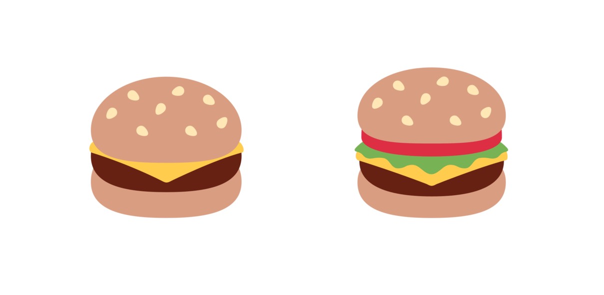
Above: Twitter added lettuce and tomato to its 2017 burger revision. Left: old; Right: new.
The topic of Facebook's burger emoji was raised in a tweet in early 2017 by Ryan Govostes, who disputed Facebook putting cheese between the lettuce and tomato:
Also who melts cheese OVER the lettuce? Samsung and FB. Emoji One puts it on top of the tomato (itself a questionable topping). Unnatural. pic.twitter.com/LqboEIHCCq
— Ryan Govostes (@rgov) March 15, 2017
An update from Facebook rectified the situation soon after, placing the cheese directly on the burger:
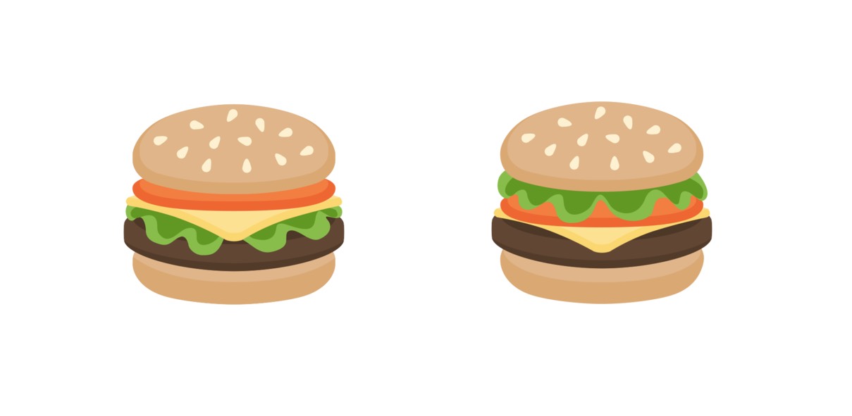
Above: Facebook redistributed its burger ingredients in mid-2017. Left: old; Right: new.
emojidex
Meanwhile Japanese open source project emojidex commented that their burger implementation was more of a local affair:[2]
“Sort order of ingredients for us was based on a popular burger restaurant nearby”
Adding:
“We've never had much feedback on this particular emoji; or at least not nearly as much as we have on pizza”
Google and other vendors have been contacted regarding their methodology for determining burger ingredient stacking order, and this article will be updated with any further responses.
While we're here, Sundar:
Hmmmm, Google, this is not how beer works pic.twitter.com/rLsmThcLKM
— Thomas Fuchs (@thomasfuchs) October 29, 2017
UPDATE: 2017-11-03
Google appears to have doubled down on its design by the looks of this "Android Burger" with cheese under the burger patty, consistent with the Google burger emoji:
Lunch at Google today: an "Android Burger" 🍔 pic.twitter.com/I4dwOUPASg
— Brad Fitzpatrick (@bradfitz) November 3, 2017
If you tap or click the emoji image next to a platform vendor name on Emojipedia, you can see the history of each emoji. The burger has changed at least once on most platforms over the years. ↩︎
emojidex actually has four burger emojis. The standard burger, but also a series of ZWJ sequences for each variation of hamburger, cheeseburger, bacon burger, and bacon cheeseburger. ↩︎
