2018: The Year of Emoji Convergence?
For years, different emoji sets have been causing problems in communicating a simple emotion. Send a grimace on iOS? Get a grin everywhere else. Send a grin from a Galaxy? Get an eye-roll everywhere else. This could be changing in 2018.
The fact that Emoji Fragmentation[1] is even a term indicates an issue with our favorite little colored characters that's outstayed its welcome.
Apple responded to a long-standing emoji complaint in 2016 by redesigning the 😁 Beaming Face With Smiling Eyes on iOS and macOS to better match the happy emotion expressed on other platforms.
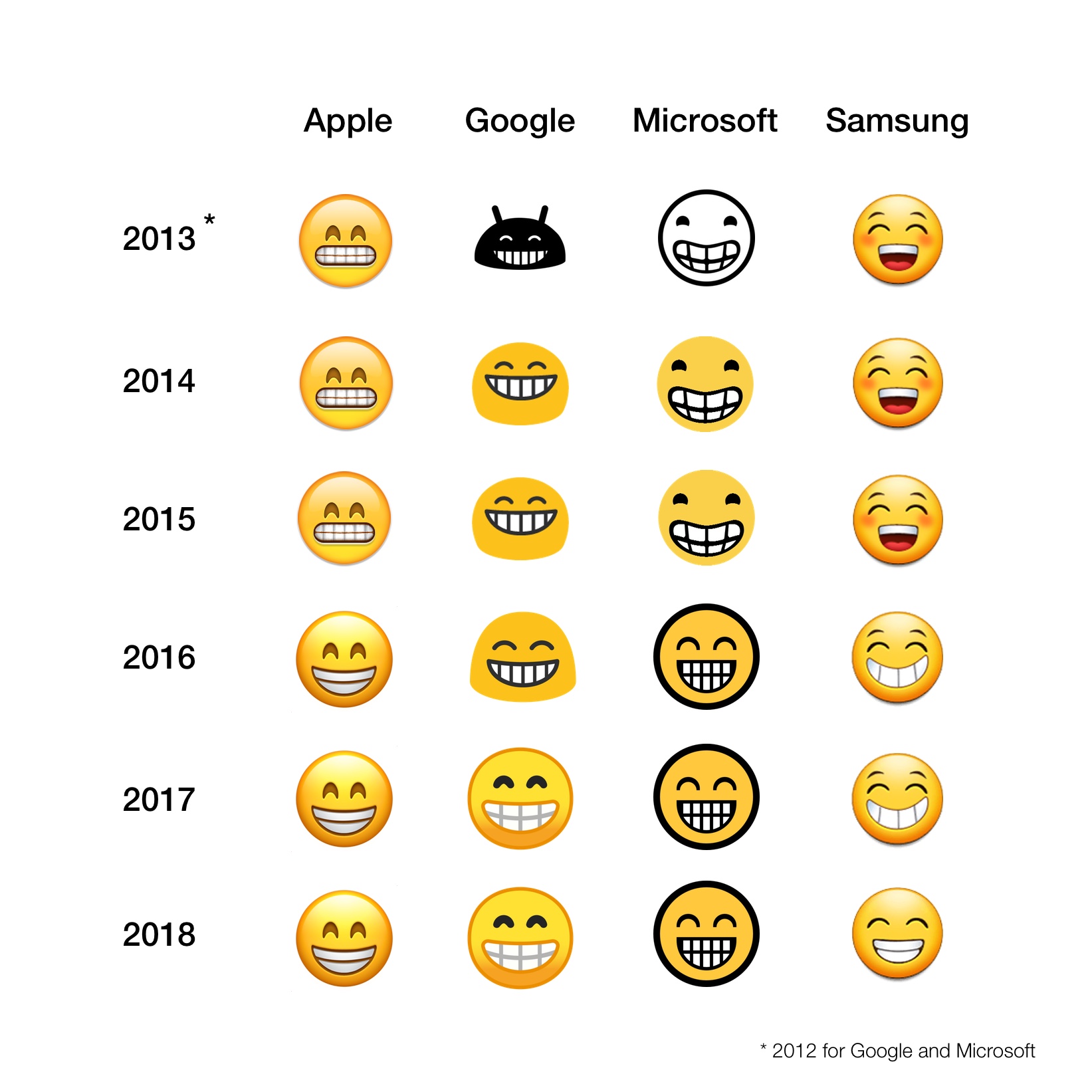
Above: 😁 Beaming Face With Smiling Eyes once looked like a grimace on iOS, and now matches other platforms. Image: Apple, Google, Microsoft, Samsung / Emojipedia Composite
Samsung this week also released a series of emoji updates aiming to bring a number of their emojis in line with other vendors.
This will be helpful for Samsung users who just want to send an emoji without (in the words of Jessica Chastain) “looking like a pervert”.
Is this a Samsung thing?!
— Jessica Chastain (@jes_chastain) February 1, 2018
The shocked emoji is what I put in my tweet and is what I see when I go on my twitter. A friend forwarded me an article that referred to it. The emoji is completely different! Is that what all of you see? Its drooling. Now I look like a pervert... pic.twitter.com/F3aaRSBzng
While some emoji differences don't overtly change the meaning of what is being conveyed, others completely change what is attempting to be said.
What we're looking at in 2018 is a convergence of many of these designs.
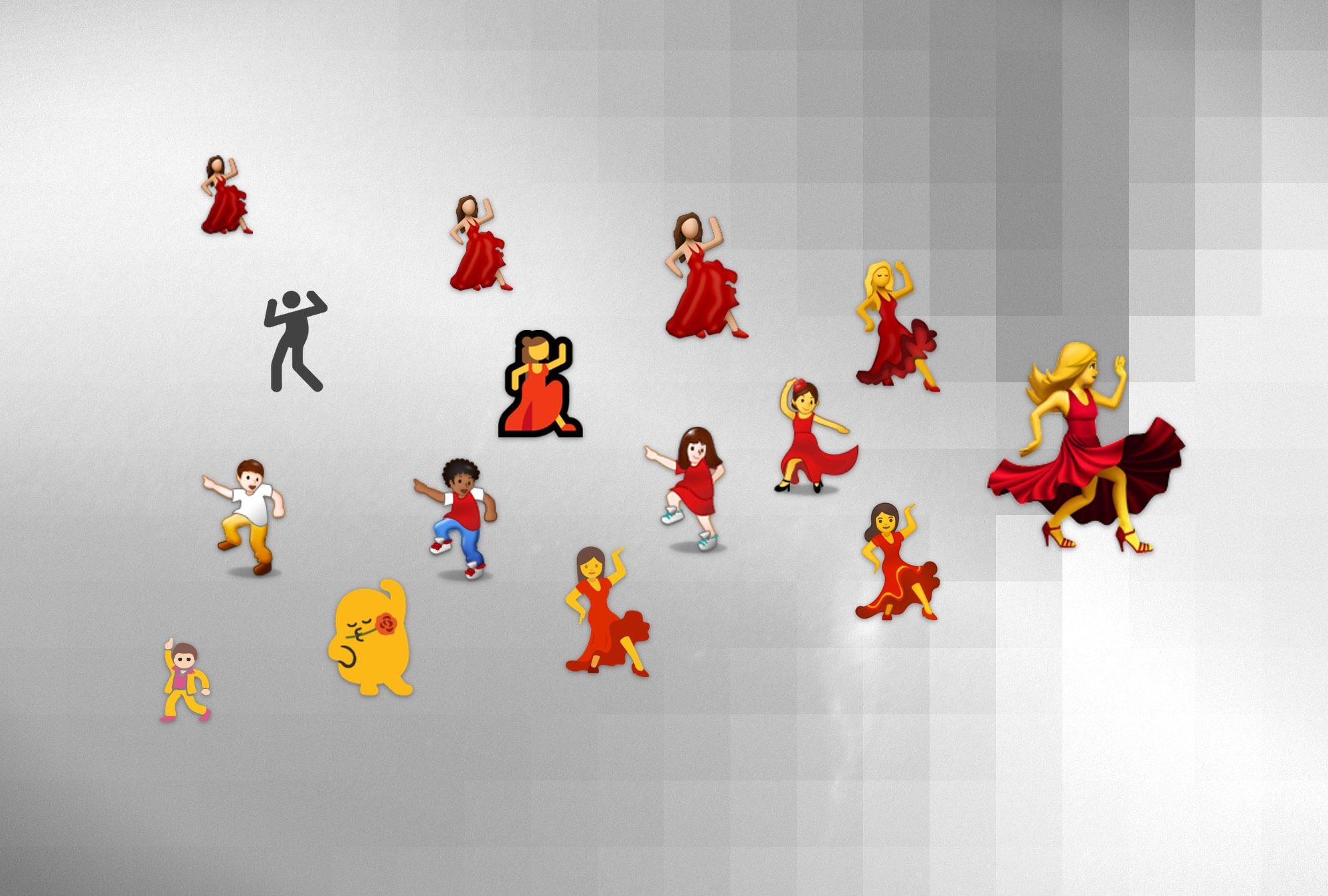
Over the past few years, the single dancing emoji that initially appeared with different genders or skin tones has morphed into a specific 💃 Woman Dancing with a red dress, one arm raised, and a leg showing more visibly than the other on most major platforms.[2]
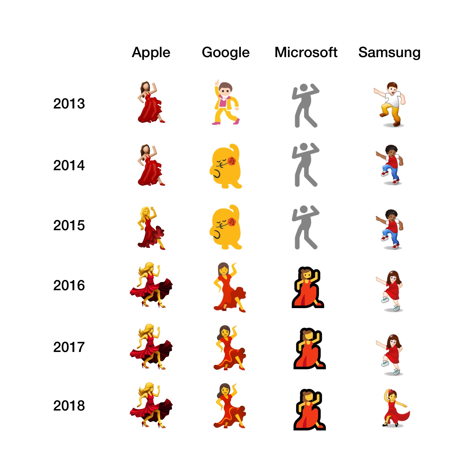
Above: Evolution of the Dancer emoji. Image: Apple, Google, Microsoft, Samsung / Emojipedia Composite.
Comparing the dancers of 2013 to the dancers of 2018 shows a clear trend in one direction: toward Apple's design choices. Not in style per-se, but in sentiment.
A notable divergence in recent years is the gun emoji.
In 2016, Apple released an update to iOS that switched out the gun emoji and made it appear as a toy water gun instead. At the time this meant Apple was explicitly moving the meaning of this emoji on iOS further away from other platforms.
Apple made it so that iOS users would send a toy, and other platforms would see a weapon.
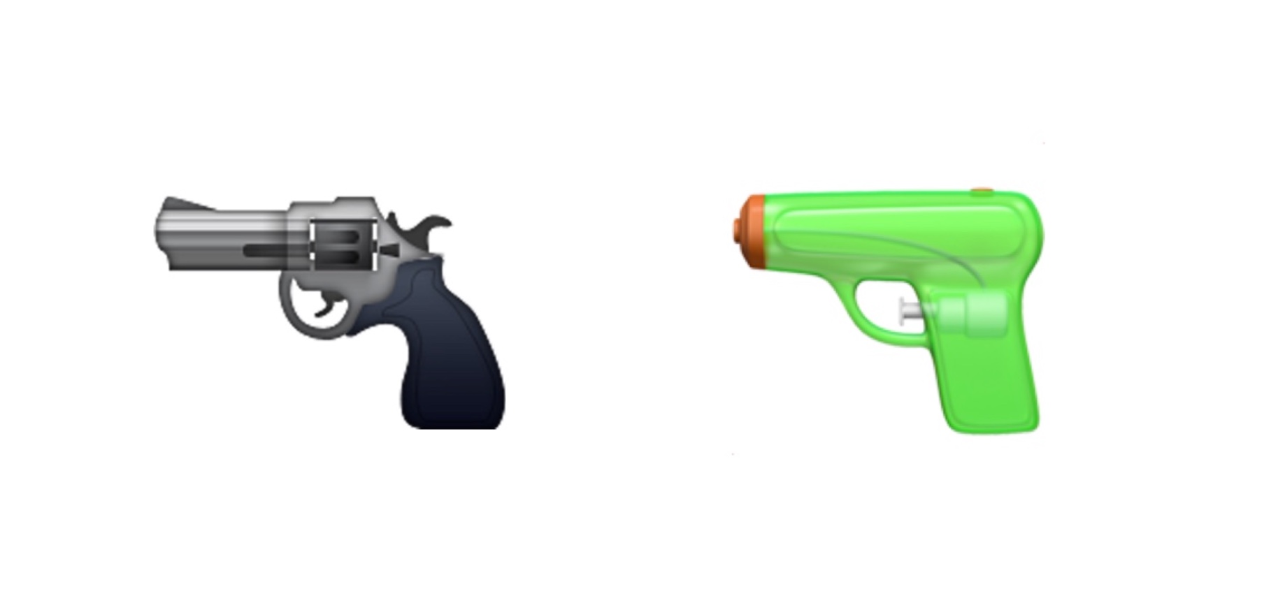
Above: Apple changed the appearance of the pistol emoji in 2016.
At the time of this change, John Gruber of Daring Fireball speculated:
“This is a tricky dilemma, but I think it’ll all work out, and other vendors will follow Apple’s lead and this glyph will be represented by a toy gun everywhere within a few years.”
It's a few years later, and it appears that may well be underway.
Samsung has this week updated their 🔫 Pistol to semantically (and visually) match Apple's green water pistol.
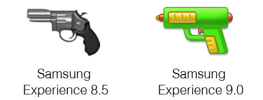
Given the large combined marketshare of Apple and Samsung, does this create a tipping point where other vendors like Microsoft, Google, Facebook or Twitter feel as though they should also change their designs?
If history is any guide, it seems very possible we could end the year with a full suite[3] of water pistols replacing the traditional gun emoji.
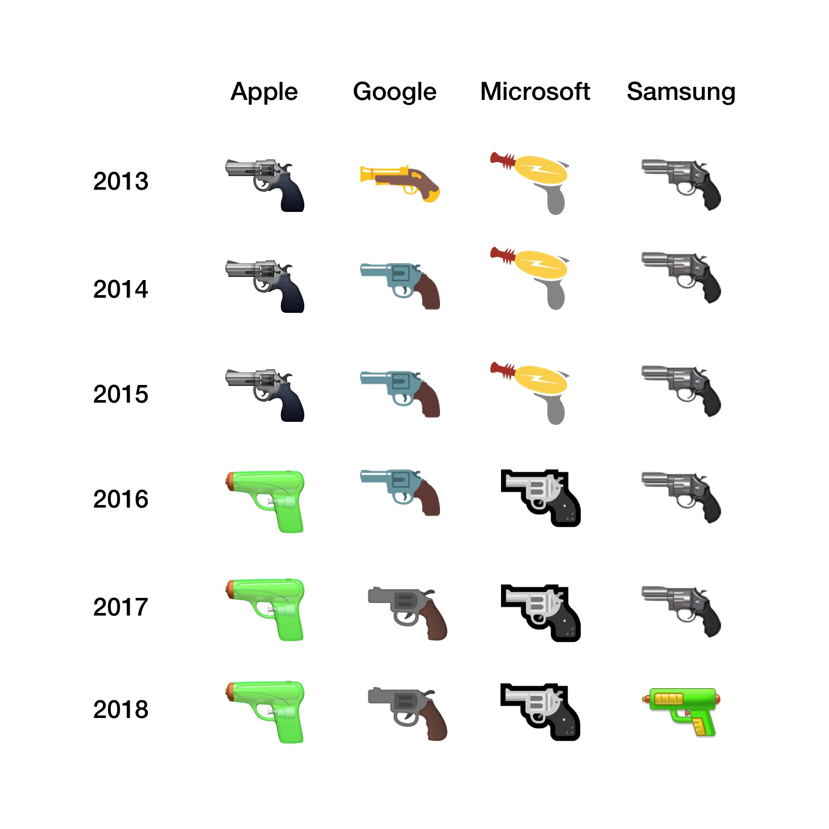
Above: A comparison of the 🔫 Pistol emoji in years 2013—2018.
One of the most common phrases mentioned by vendors when updating emoji designs is “better compatibility with other platforms”.[4] Generally speaking this means “better compatibility with iOS”.
Some users object to this move toward matching Apple's designs, but if the end result is emoji being more helpful to more people, this seems like a win (regardless of personal preference for any specific emoji design).[5]
Phones will continue to have their own style of emoji as the years progress, but 2018 could be shaping up as the first year that major platforms include emoji designs that are emotionally compatible with one other. In my opinion, that is a good outcome for everyone.
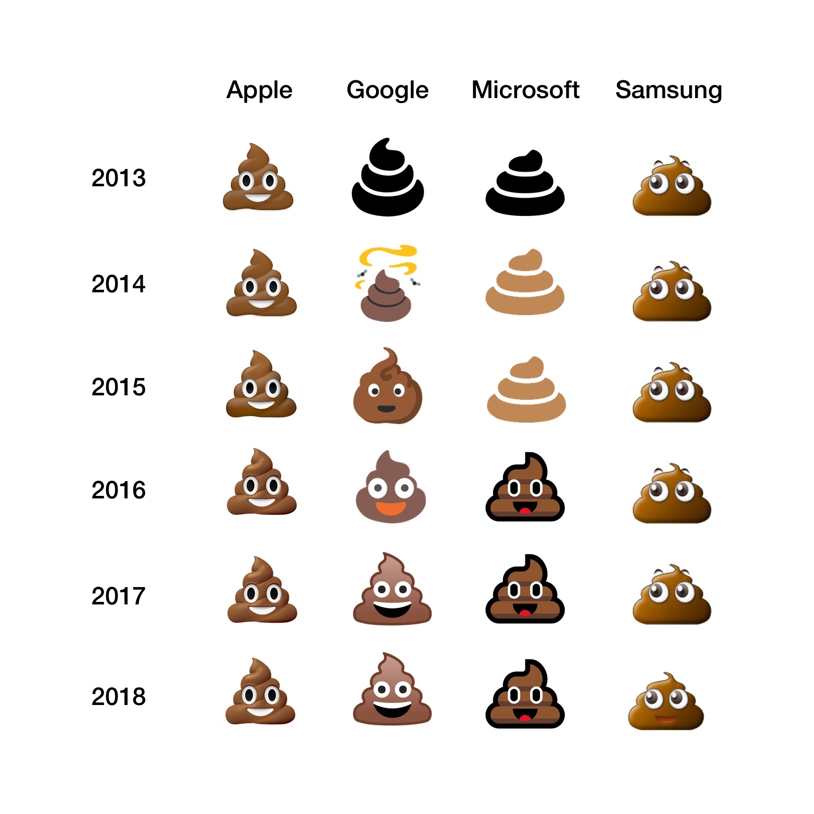
Above: Consistently smiling 💩 piles of poo. Apple's. Images: Apple, Microsoft, Samsung, Google. Emojipedia Composite.
Update: Even the 🍔 burgers are converging! All platforms now display a slice of cheese directly on the patty. Something that Google saw headlines over last year.
…also in emoji news this week: Samsung quietly moved the cheese directly on top of the burger patty 😊 pic.twitter.com/ohbRgcrOuP
— Jeremy Burge (@jeremyburge) February 13, 2018
First coined by Jason Snell on Upgrade with Myke Hurley in 2015, as best as I can tell, and a common theme on Six Colors and elsewhere over the years. ↩︎
A separate emoji exists for dancing man, which allowed vendors that previously showed this as a man to continue to have both. ↩︎
WhatsApp came out with its own emoji set in 2016, and this also displays the gun as a water gun. ↩︎
I asked Google's design team about whether they planned to change their gun to a water pistol at the time, and the response: “we'll see” ↩︎
I still hear from a (small, but vocal?) selection of users who pine for Android's blobby Casanova. ↩︎
