RIP Blobs: Google Redesigns Emojis
Android's infamous blob emoji is dead.
Having appeared in various shapes and sizes since Android 4.4; the amorphous blob that defined Google's emoji appearance since 2013 is being retired.
Update August 2017: Android 8.0 Oreo has been released. See what's new.
In its place: a redesign of every emoji in Android, coming as part of Android "O" which was announced today at Google I/O.

Above: The new design style in Android O applied to emojis new and old.
In addition to the redesign, Google is the first major vendor to announce full compatibility[1] with Emoji 5.0 which means a vomit face, orange heart, and dinosaurs are on their way.
End Of An Era
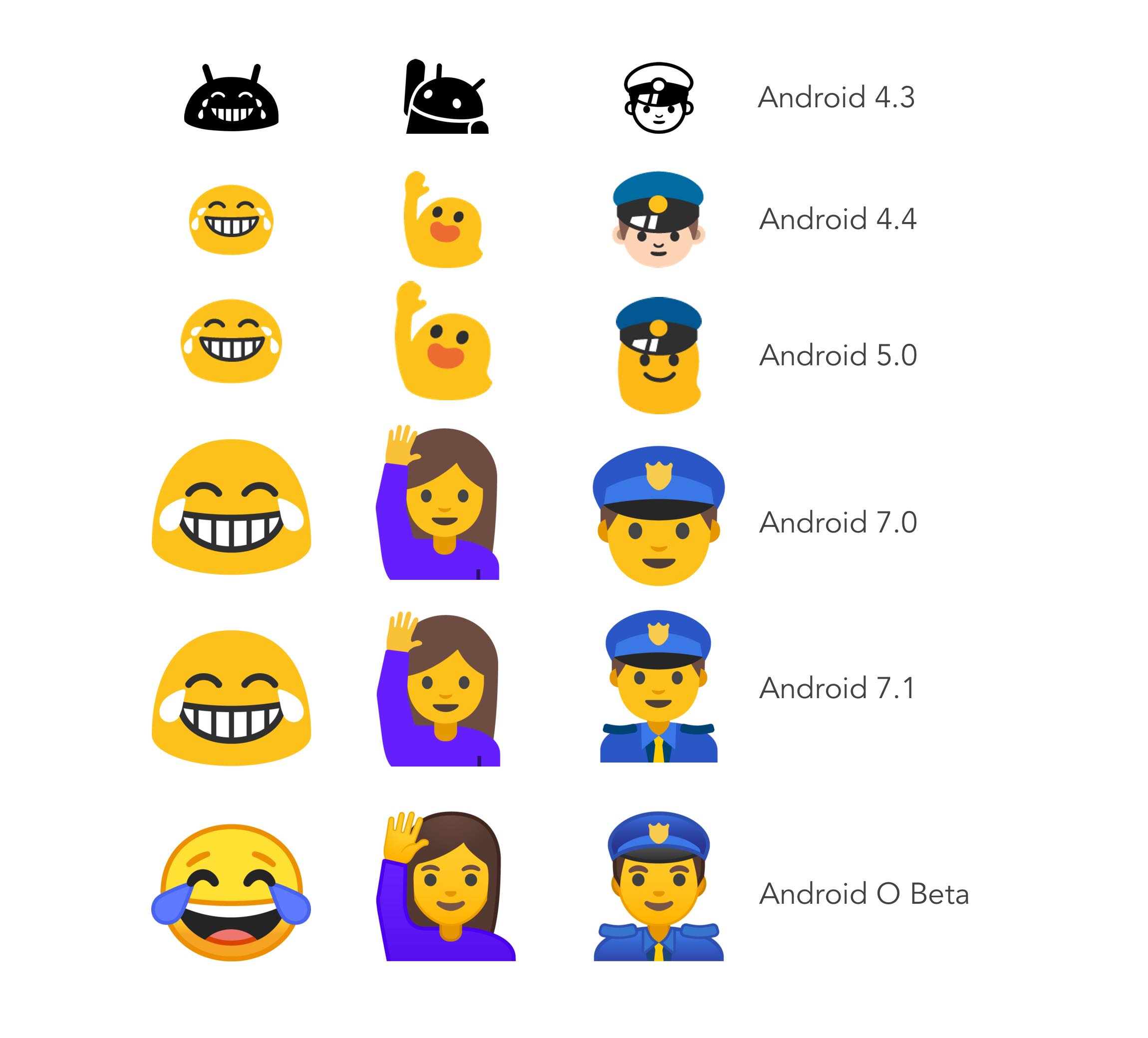
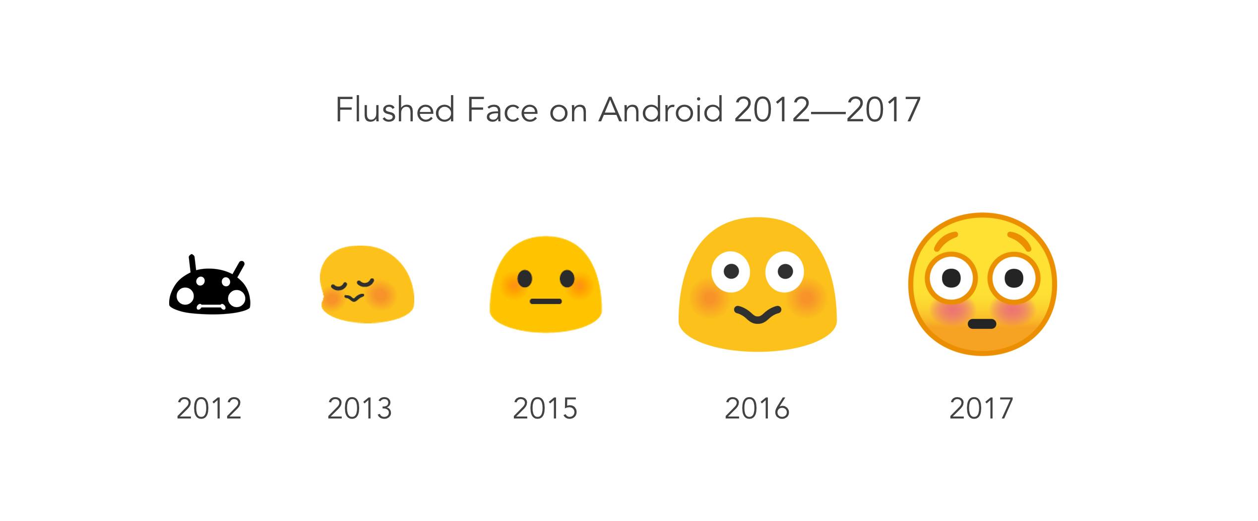
The "blob" character seen in previous versions of Android has been a divisive character; morphing over time from an alien, into a consistent gumdrop shape.
In Android O, the gumdrop is gone: replaced with round smiley shape, consistent with all other operating systems.
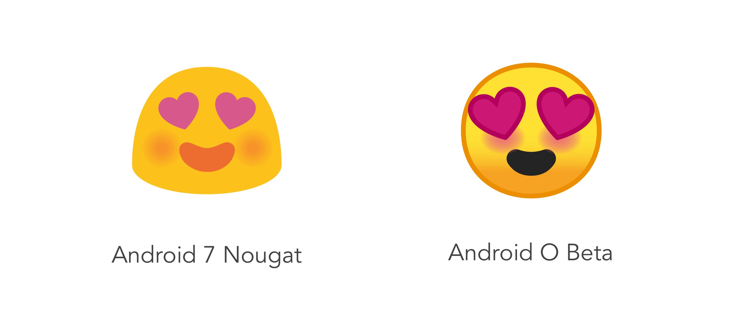
Google's blob character first entered the scene in 2013, when smileys that looked like aliens in older Android releases were replaced in Android 4.4.
Android 5 Lollipop furthered this trend in 2014, by making all emojis - including the humans - use various incarnations of blob, gumdrop, or worm:
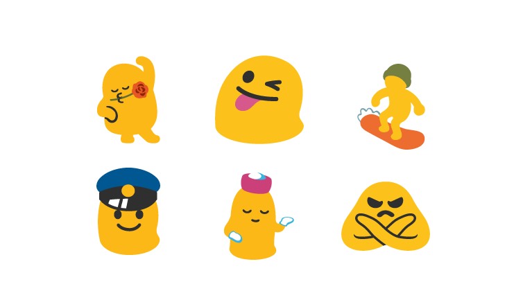
Above: Android Lollipop had many variations of this character in 2014.
As of 2016, Google continued to follow Unicode recommendations, which by this stage recommended genders and skin tones for human emojis.
This left only the smileys with the gumdrop shape, which is now resigned to history.
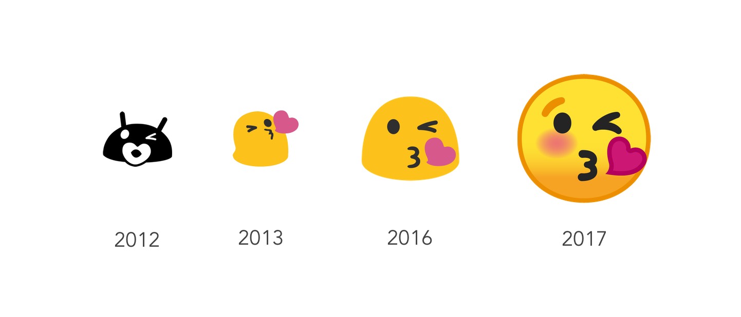
Above: Evolution of the 😘 Face Blowing a Kiss on Android.
It's fair to say that while some enjoyed the charm of the blob character; the love was not universal.
Some may have enjoyed the different appearance, but others found it a frustration when sending to other platforms.
Redesign
It's not just the blobs that have changed in this release. Every single emoji has been redesigned.
This redesign ditches some older Android conventions (such as a ban on the colors pink or red) and starts anew with a tonal stroke around each emoji, and gradients now used on a number of designs.
For those used to the old Android designs, some of these emojis will remain familiar, while others could take some getting used to.
It was clear the old set had several layers of history baked in: slightly different colors between emojis, some appeared larger while others were smaller.
Proportions are now consistent throughout the entire Noto Color Emoji font.
Google tells Emojipedia the work for this update has been ongoing for nearly a year.[2]
Emoji 5.0
Emoji 5.0 is the 2017 emoji list, finalized in March 2017. Many of these emojis rely on characters from Unicode 10.0, which is currently in beta.
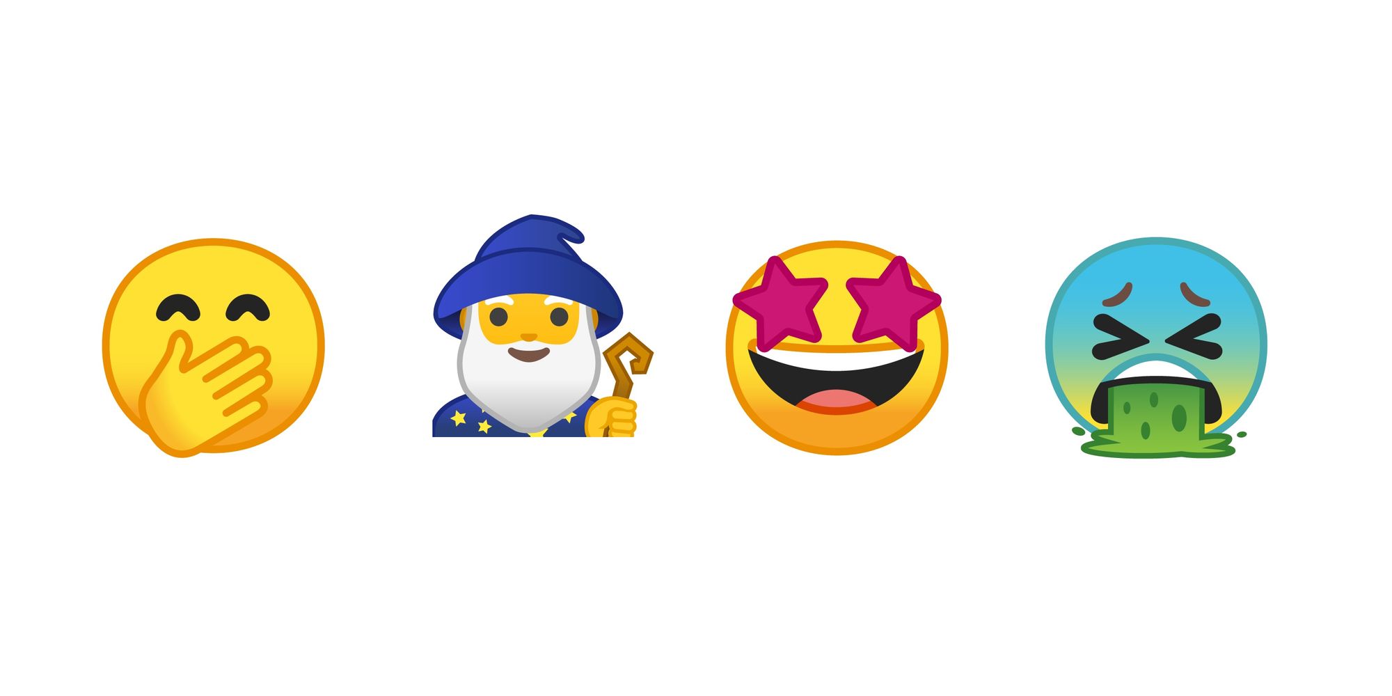
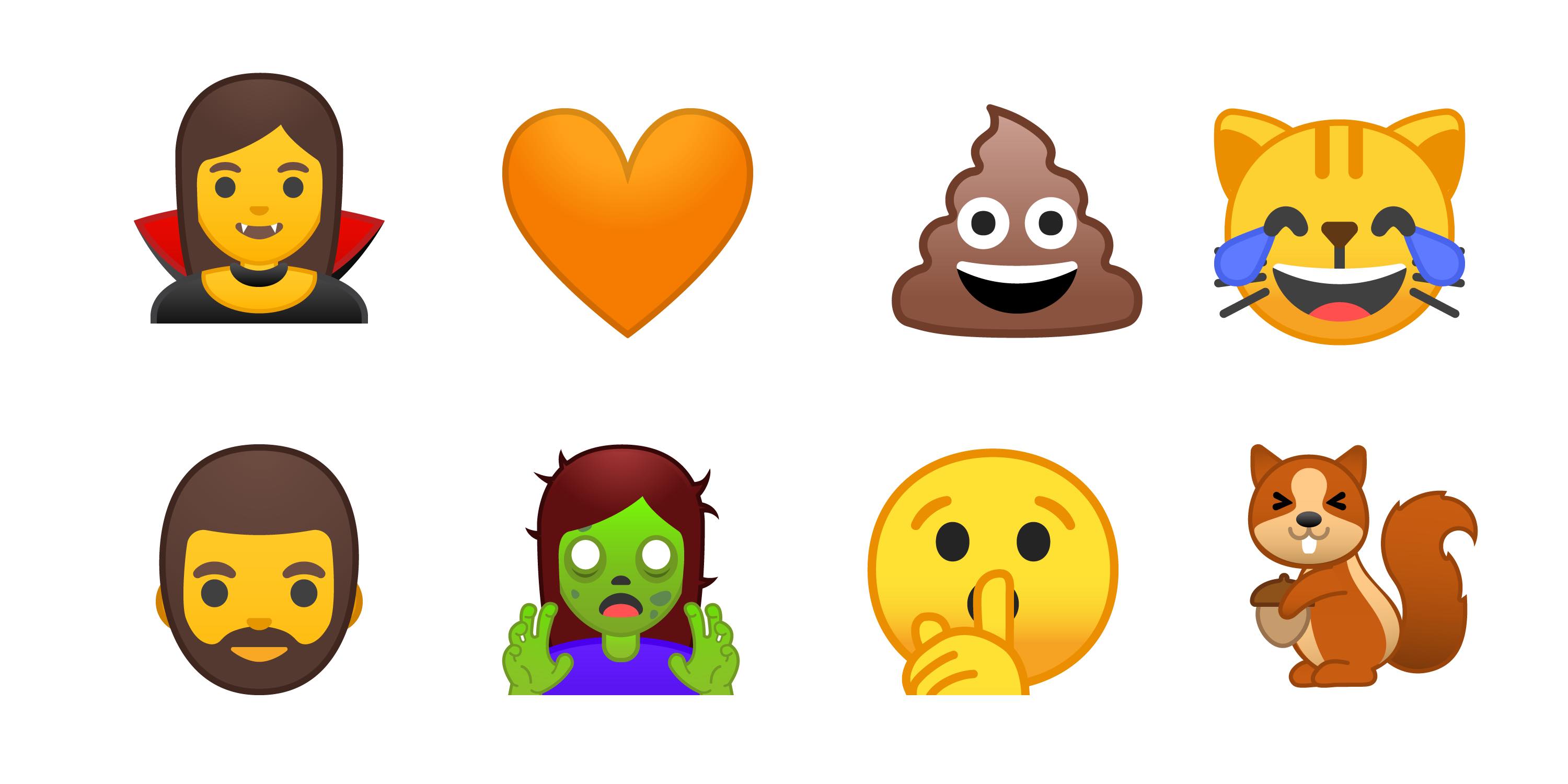
Android O supports the entire Emoji 5.0 set of additions. These include new faces, food, sports, and fantasy characters.

Above: New Emoji 5.0 characters are supported in Android O.
Shown above:
Other popular emojis that are also new in this release include giraffe, pretzel and dumpling.
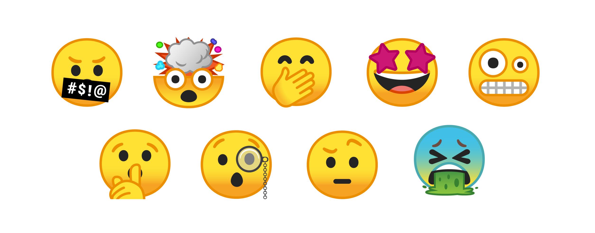
Among the updates, a total of nine new smileys are supported, all shown below.
Release
Android O is expected to be released in the second half of this year. No release date is yet known, though a developer beta is now available.
Also mentioned by Google is functionality which would allow users to download newer emoji fonts to support the latest emojis even on older Android versions.
This could fix a long-standing issue faced by Android users where new emojis cannot be seen for years, if updates are not provided. More to come on this.
As with any beta software, these emoji designs are subject to change by the final release.
This article updates.
Emoji Updates, First
Sign up to our free newsletter for the latest emoji news, first. Sent once per month, it's the best way to stay on top of what's happening in the world of emoji. Just enter your email here:
The key word here being announce. It's possible that other vendors may ship support for Emoji 5.0 before Android O finalized. ↩︎
I spoke to Google's design team last year, and some of these design changes may have been hinted at, though not obviously at the time. "But some people hated the blob". ↩︎